Vrbo: Vacation Generator Tool
Project Overview
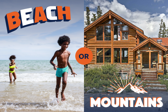
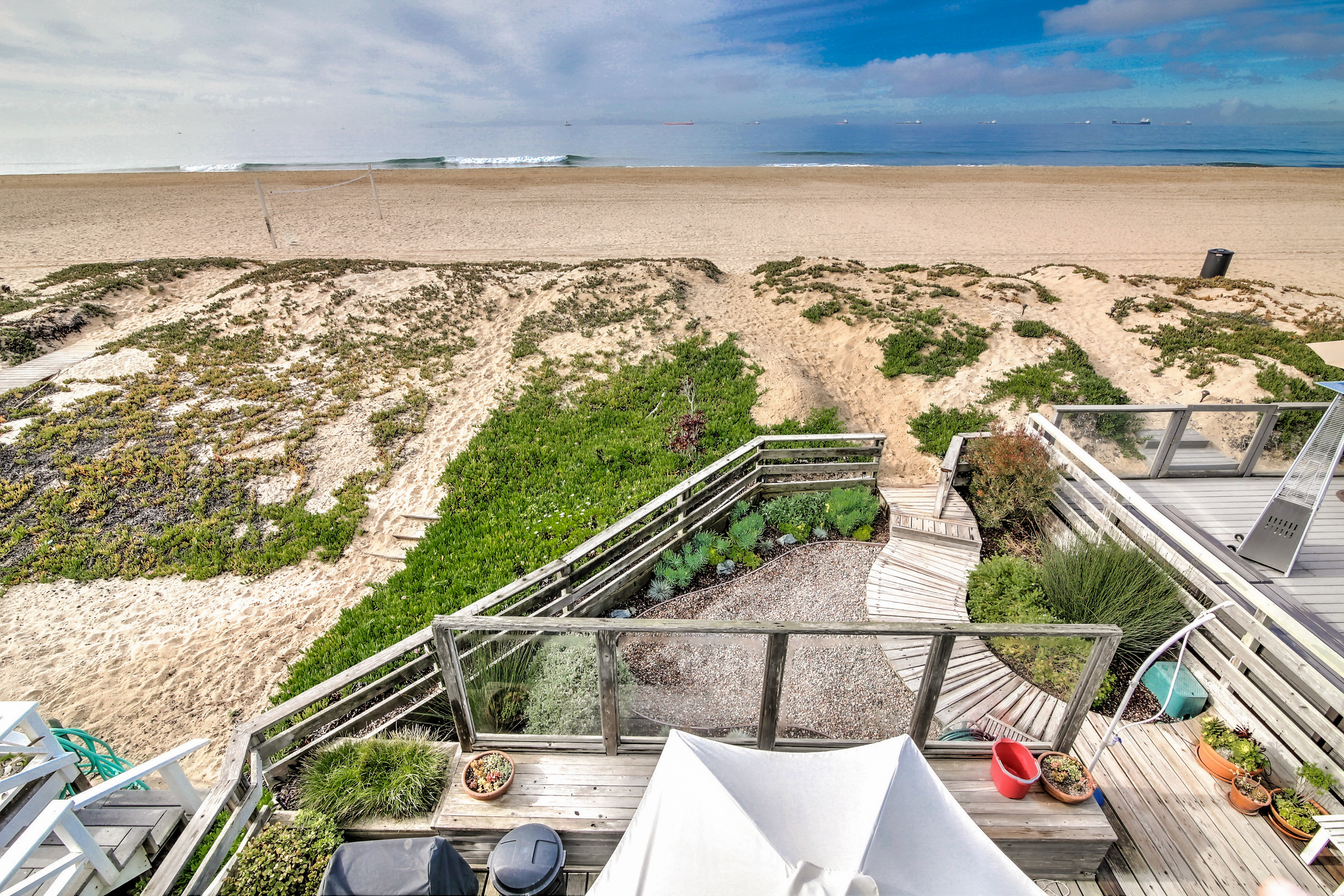
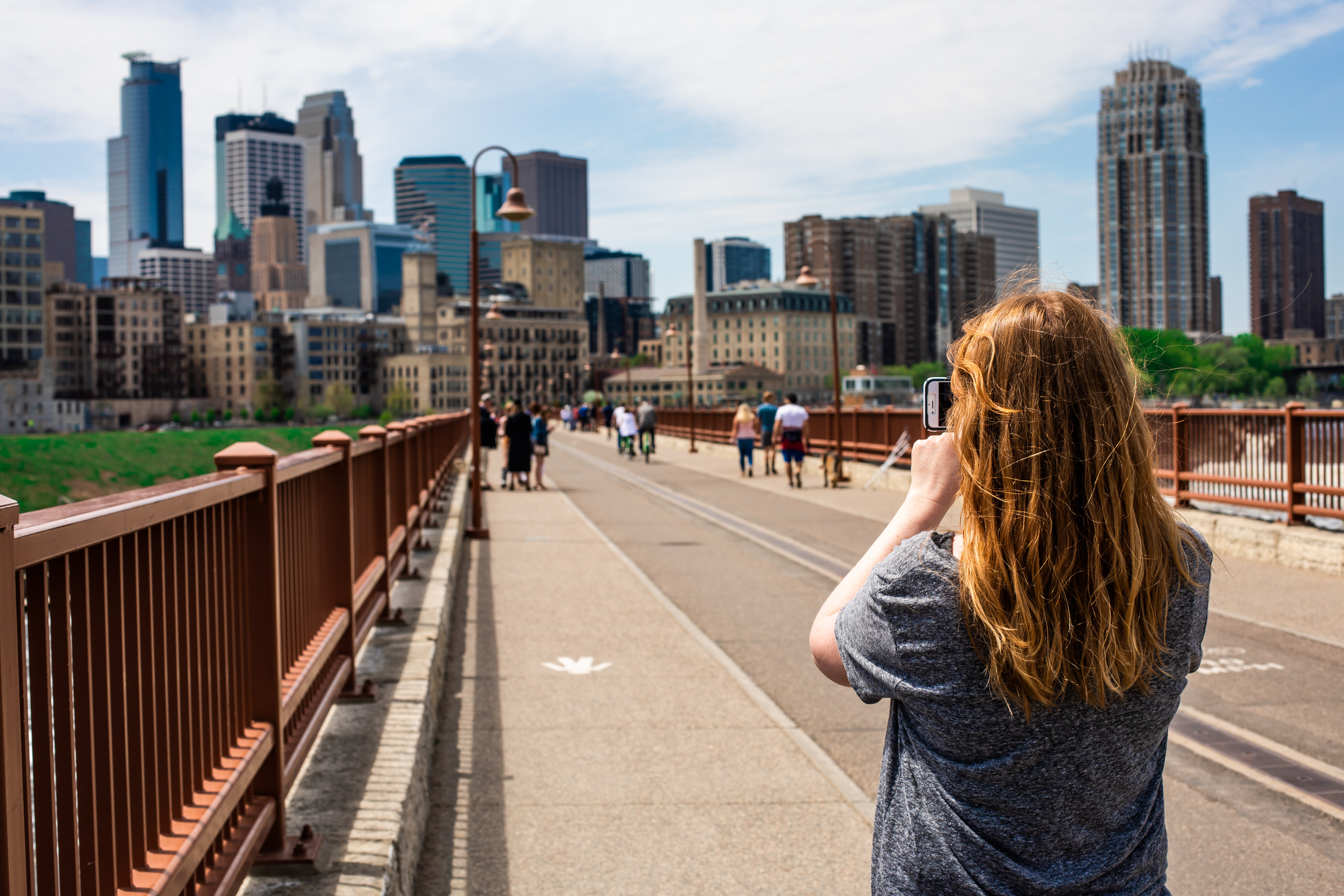
Vrbo connects homeowners with families looking for something more than a hotel for their vacation. In collaboration with a Content Designer on Vrbo‘s Brand team, I created an inspirational destination generator tool to help travelers find the perfect stay for their family’s next getaway. From a business marketing perspective, this project generated database growth and drove healthy customer engagement. In addition to the experience design, I sourced all photography with a diverse and inclusive lens.
ROLES
Product (UX/UI) Designer, UX Researcher
Deliverables
Wireframes, prototypes, photography sourcing, Vrbo.com homepage banner; marketing assets for social media, email, and web banner advertisements
Timeframe
Four weeks

Customer Problem
Vrbo customers are often frustrated when affordable vacation homes in the top destinations sell out during peak months. When that happens, they turn to our competitors’ inventory. These travelers need ways to discover new locations which may not be as popular, but still cater to their vacation needs.
There are many variables involved in organizing a vacation—location, season, geography, and type of activities—and it can be difficult to collate all options. This problem is exacerbated when planning for large families, the most common user group of Vrbo’s product.
Highlights
From a simple quiz to a robust tool
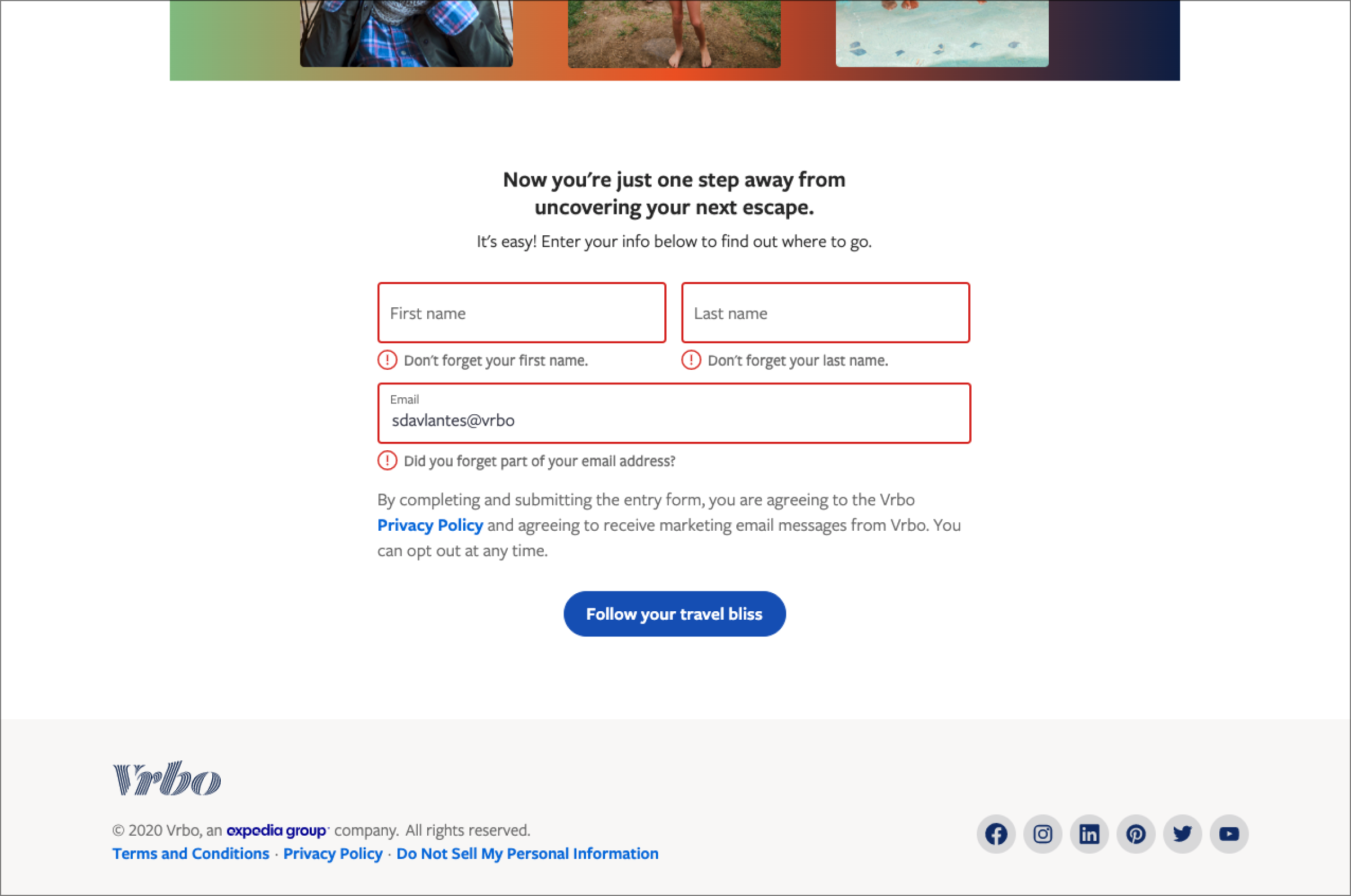
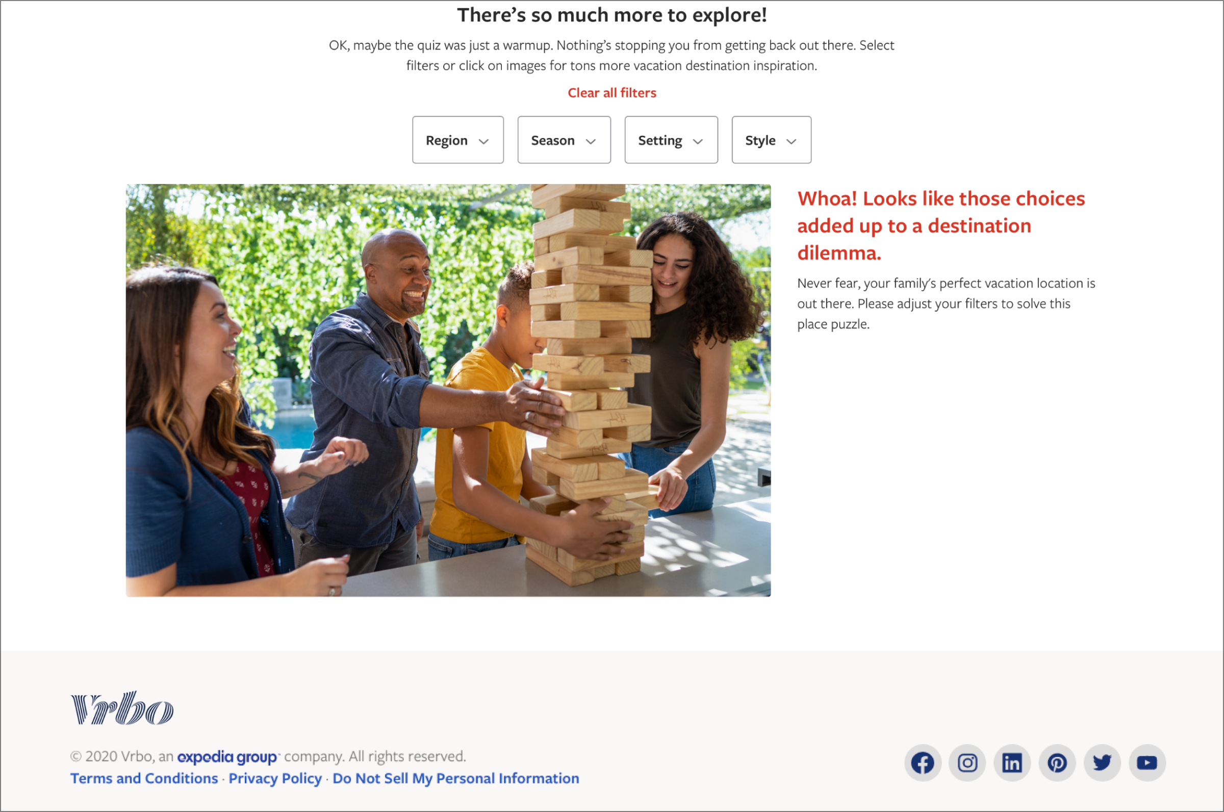
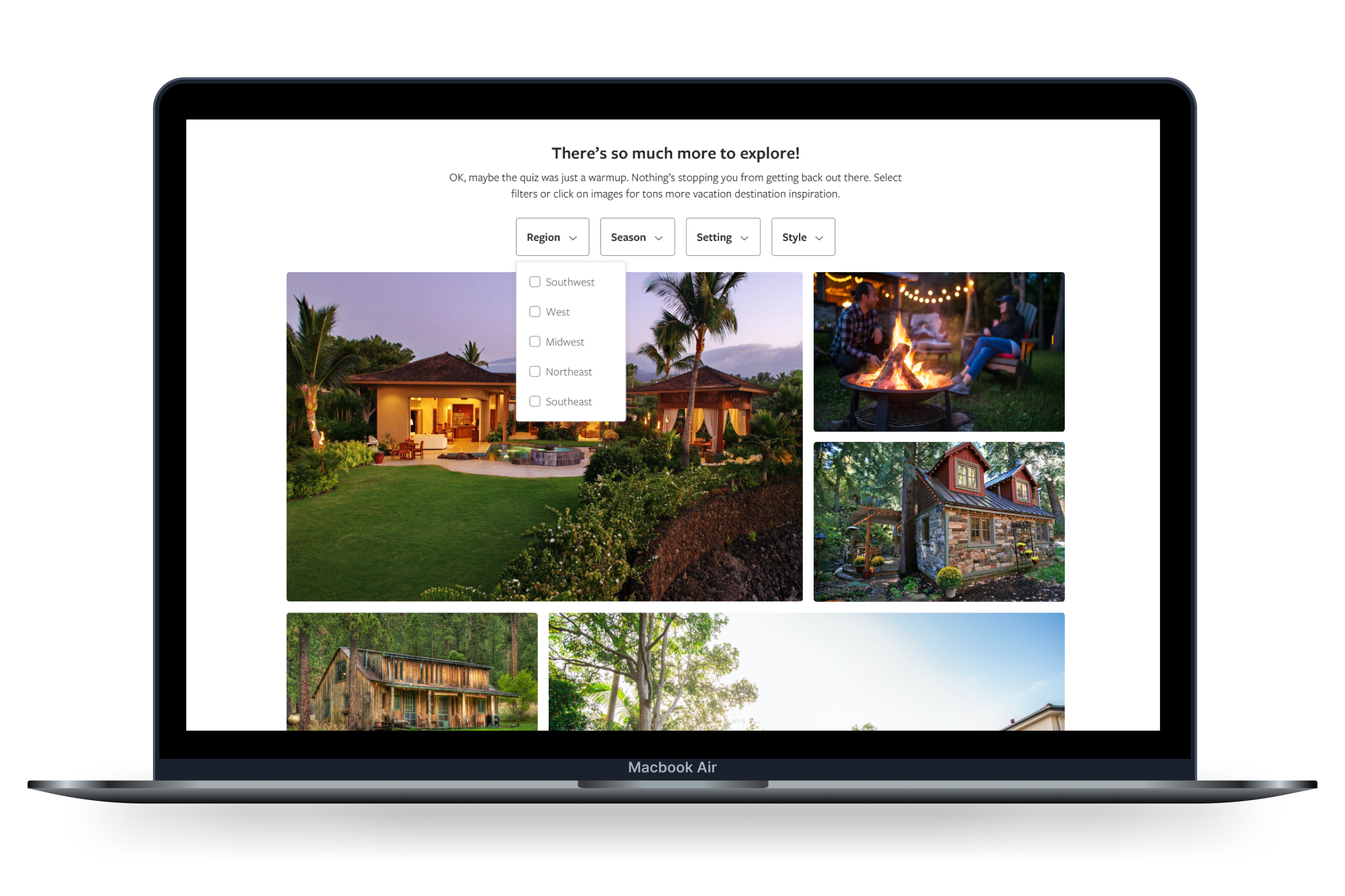
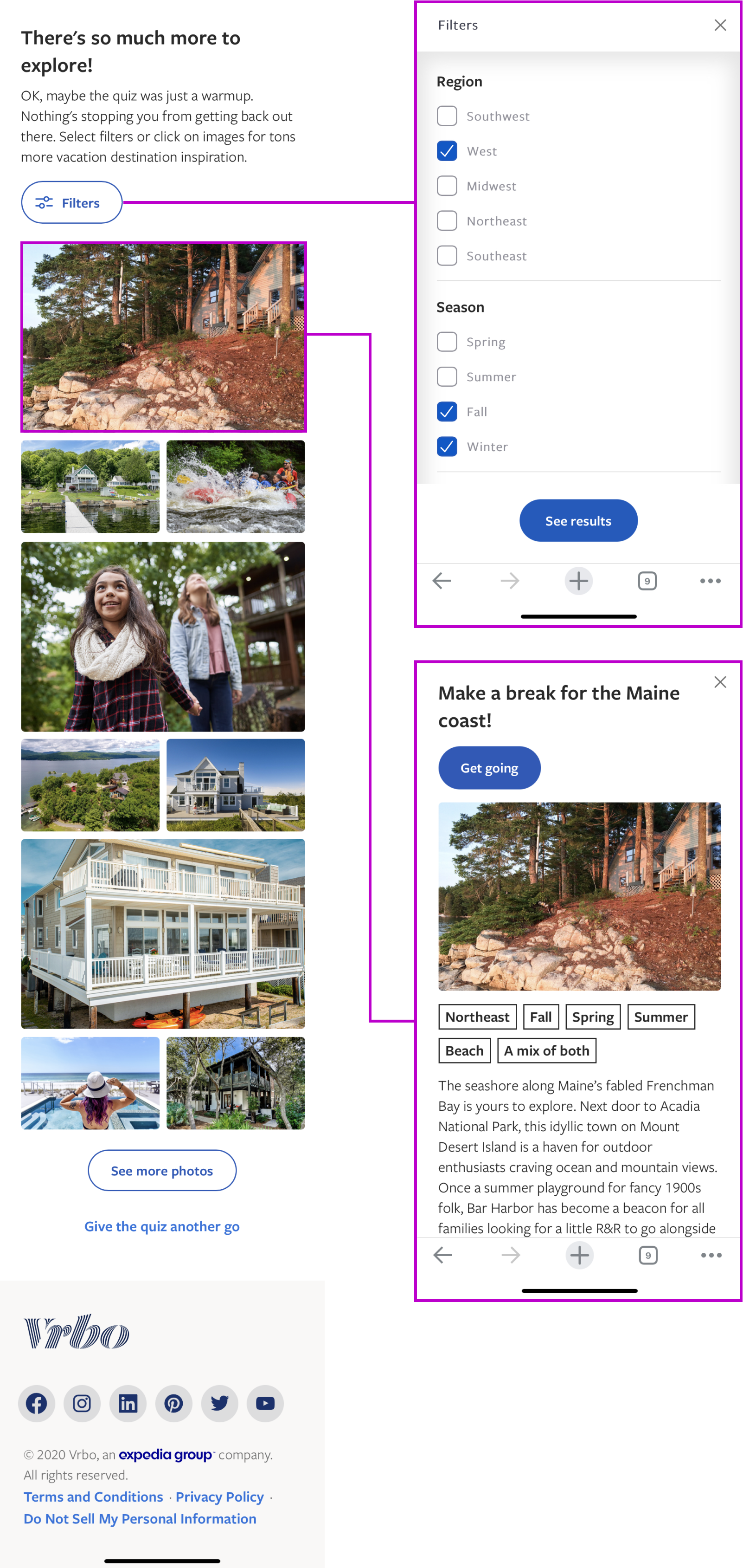
I took the assignment one step further and turned the quiz into a destination generator tool. After the email capture, the website displays the results of the quiz. Travelers can interact with the filters to explore other possible quiz answers and view the destinations generated by all variable combinations.
Direct collaboration with engineering teams
This quiz was designed for both mobile and desktop breakpoints. I was the first line of contact with an external engineering team to coordinate the development of this website.
Step 1
Research & Task Flows
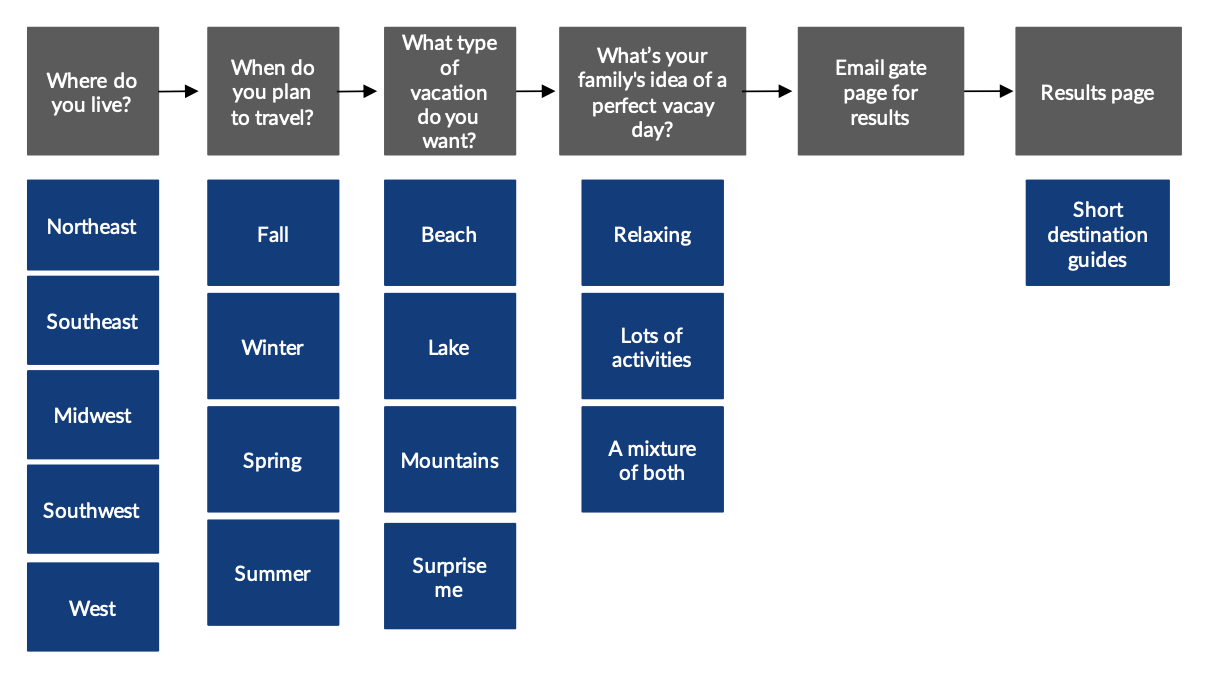
My comparative analyses of successful quiz flows determined that a short, four-question format would best maintain engagement with our users.
Step 2
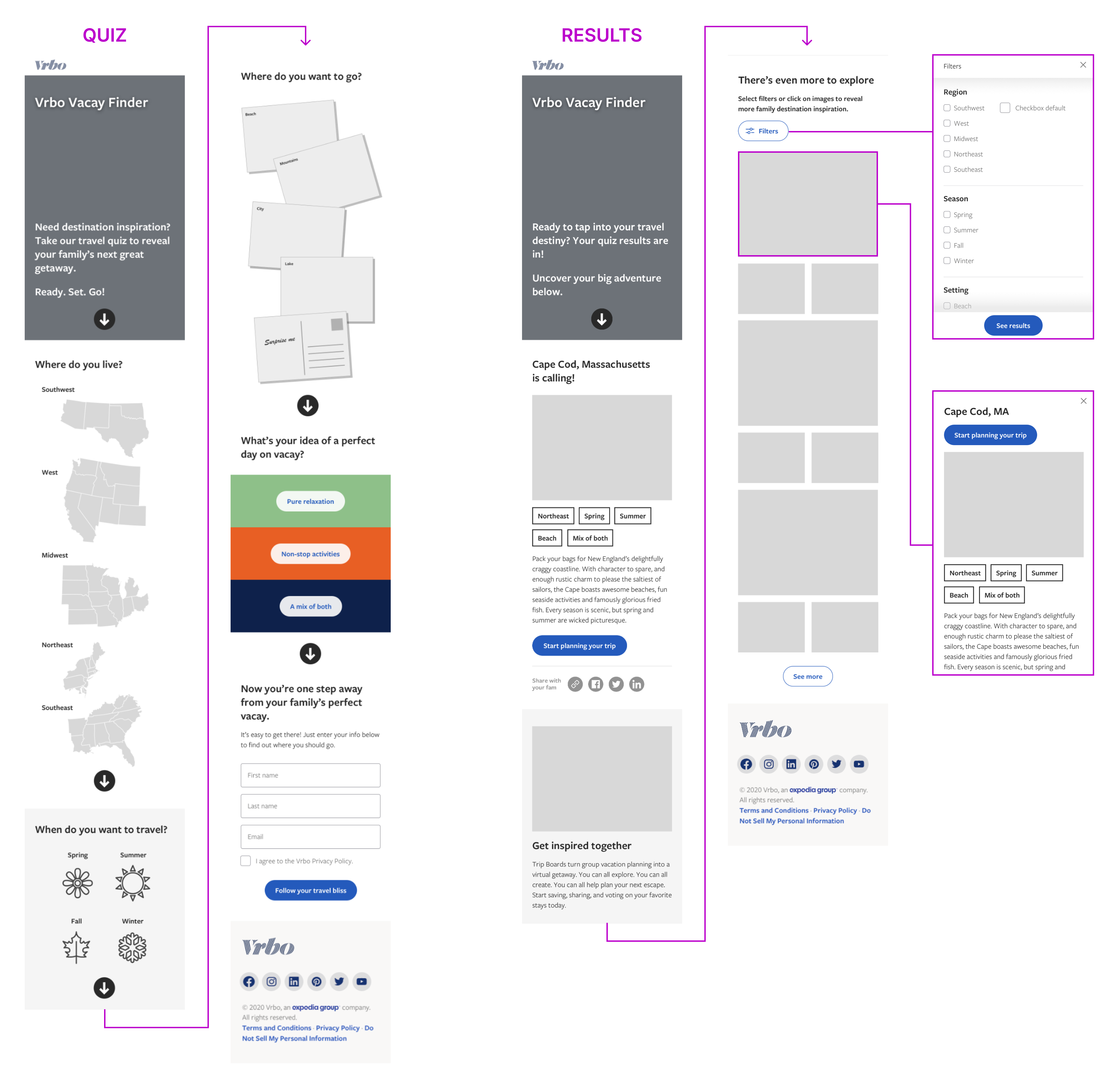
Mobile Wireframes
I designed for mobile first, as research dictated the majority of our users would interact with this website on handheld devices.
Step 3
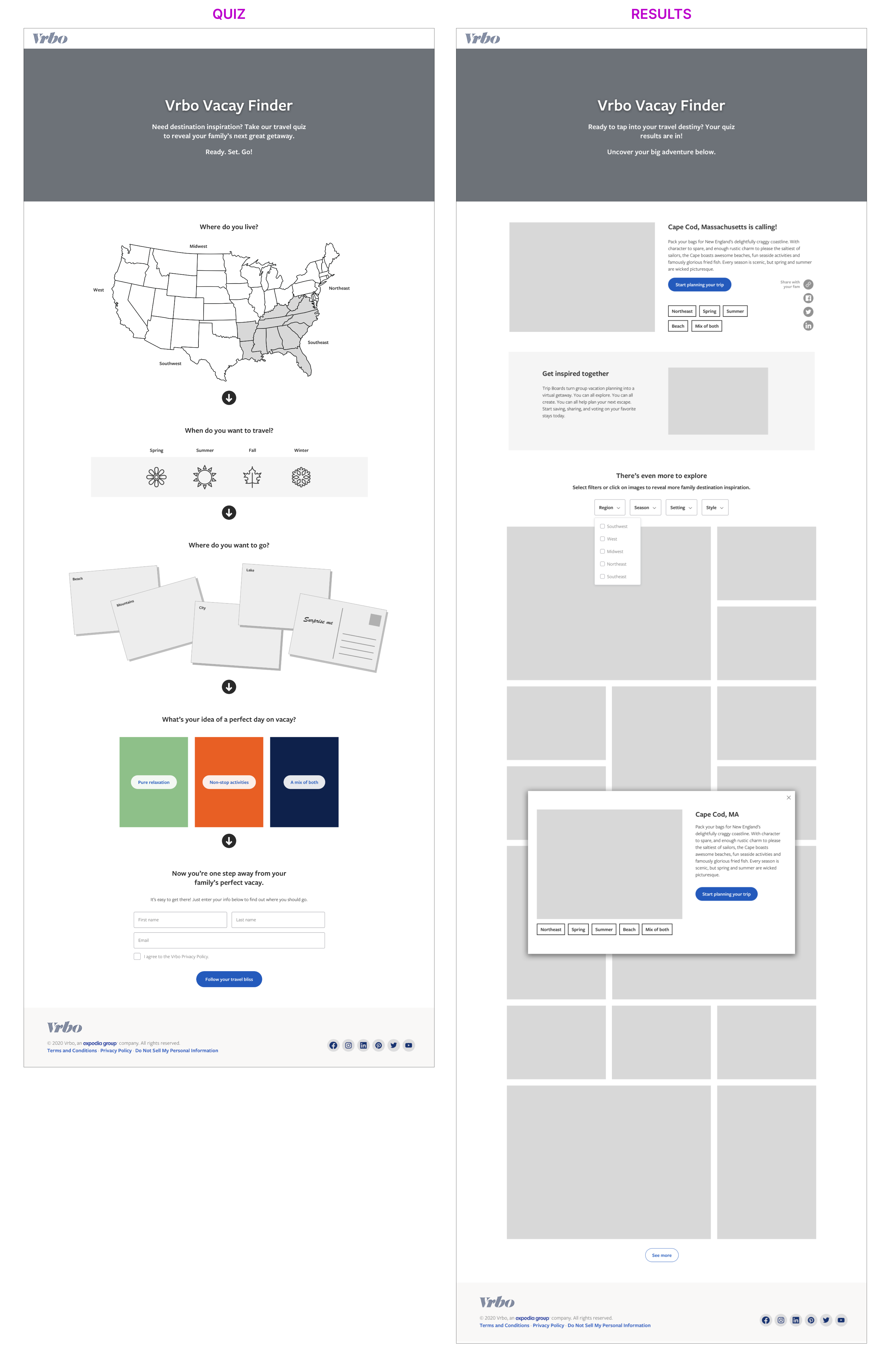
Desktop Wireframes
I recognized that gating the quiz results behind an email capture is somewhat of a dark UX pattern, but this was a project requirement. The marketing department wished to generate leads from this quiz.
Step 4
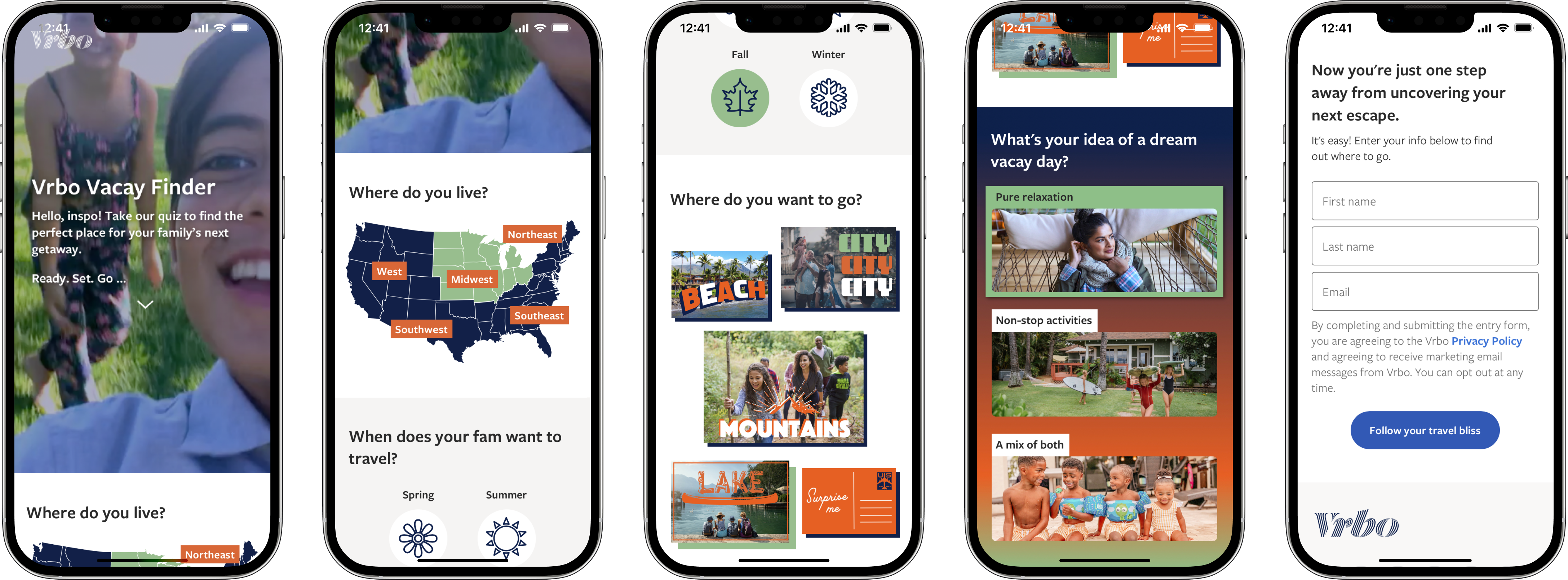
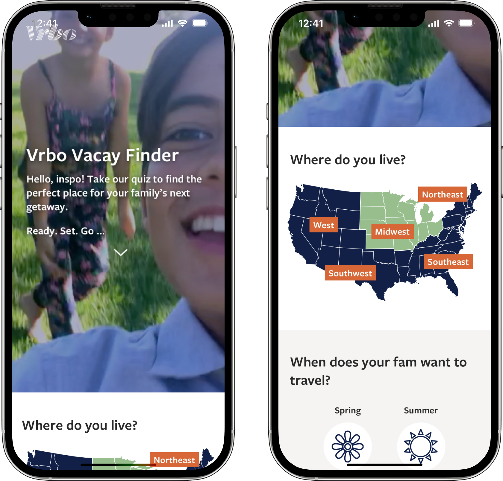
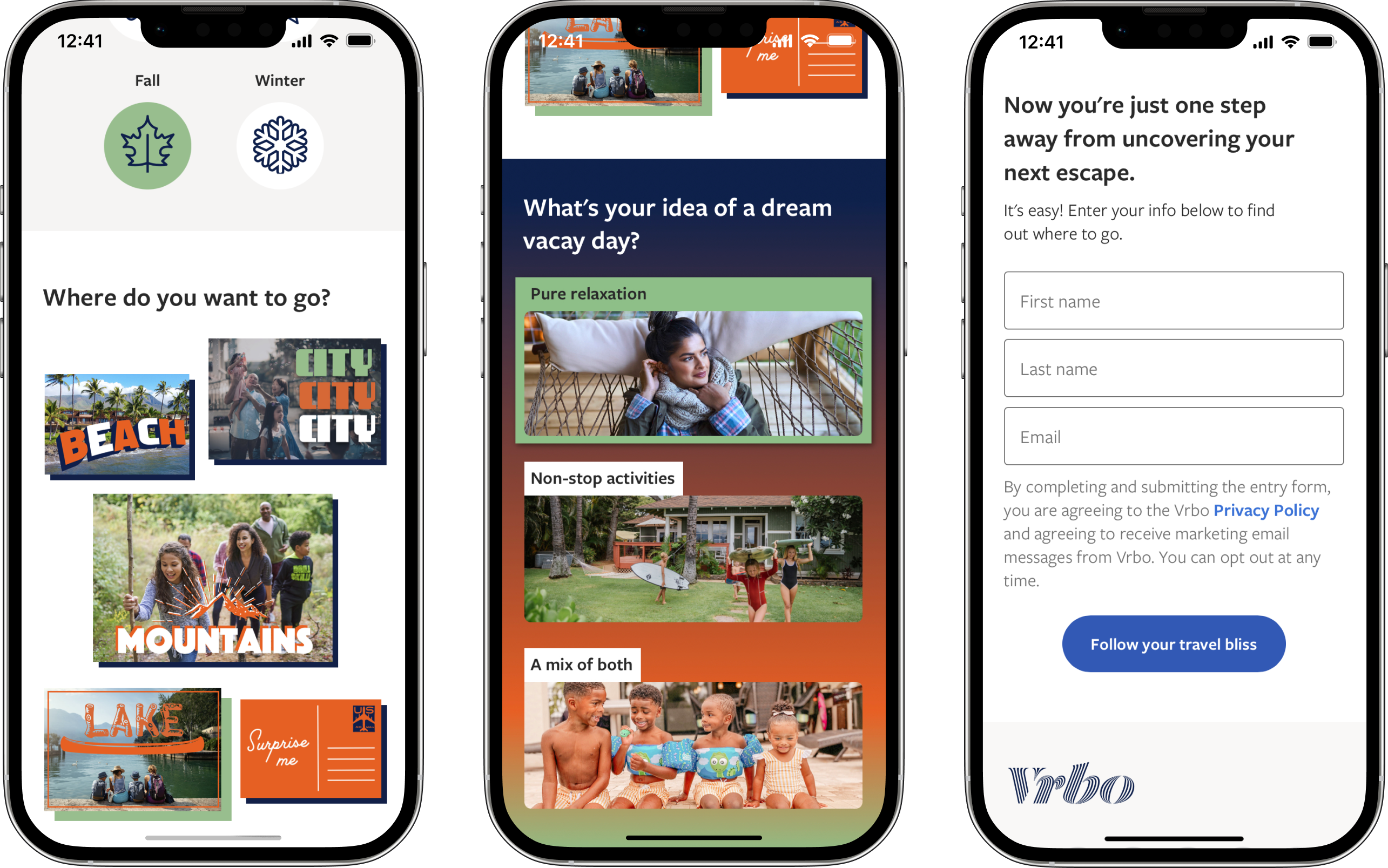
Mobile Mockups
Working within the Vrbo brand design system, I added colors and graphic elements to the mockups.
I collaborated with other Product teams to highlight their work on Trip Boards (as seen in the orange section) and encourage user adoption of that new feature.
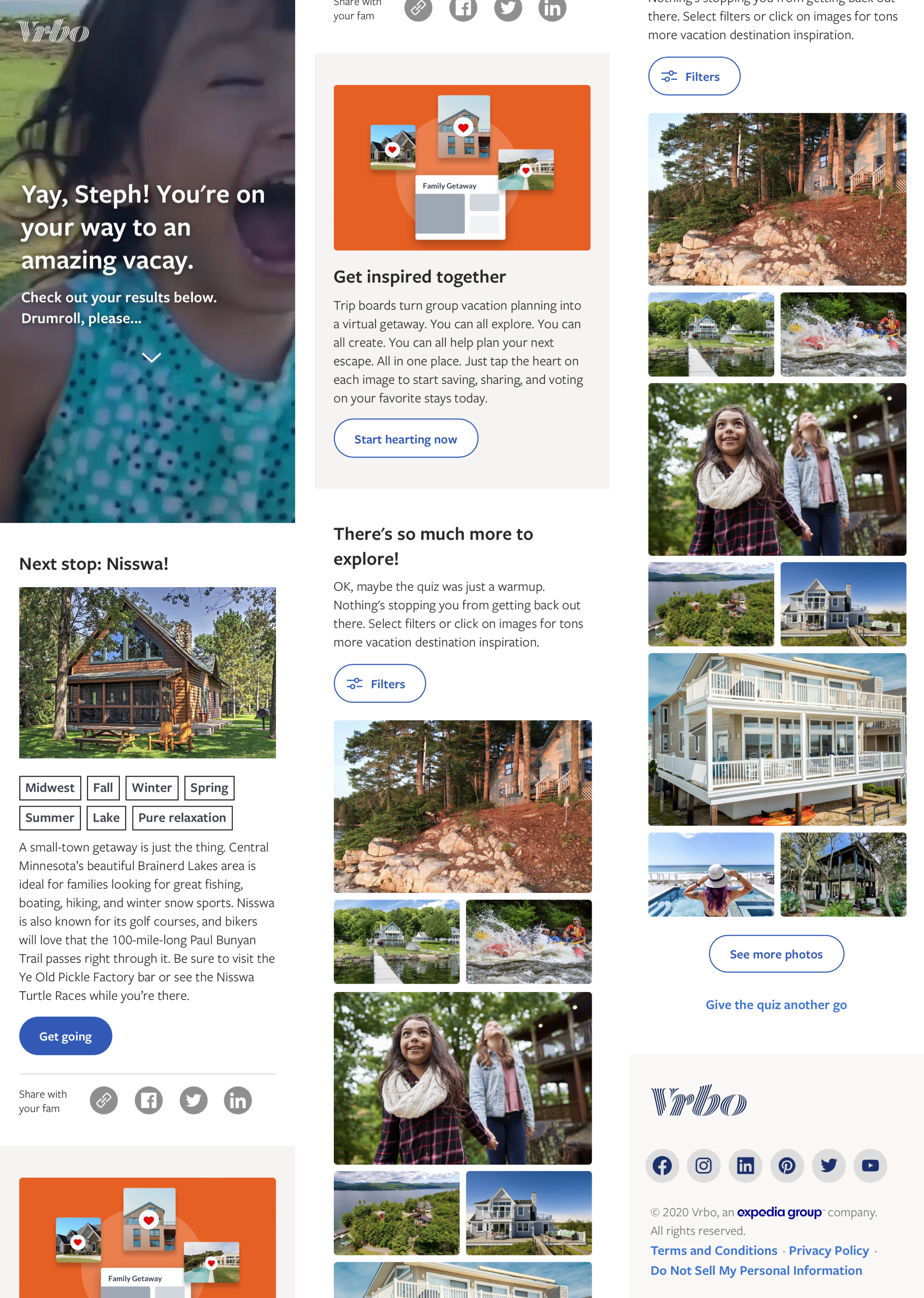
From a simple quiz to a robust tool
To generate more delight for the user and express gratitude for their email capture, I transformed the simple quiz into a complex destination generator tool. Travelers can interact with the filters and image tags to explore other possible quiz answers and view the destinations generated by all variable combinations.
Step 5
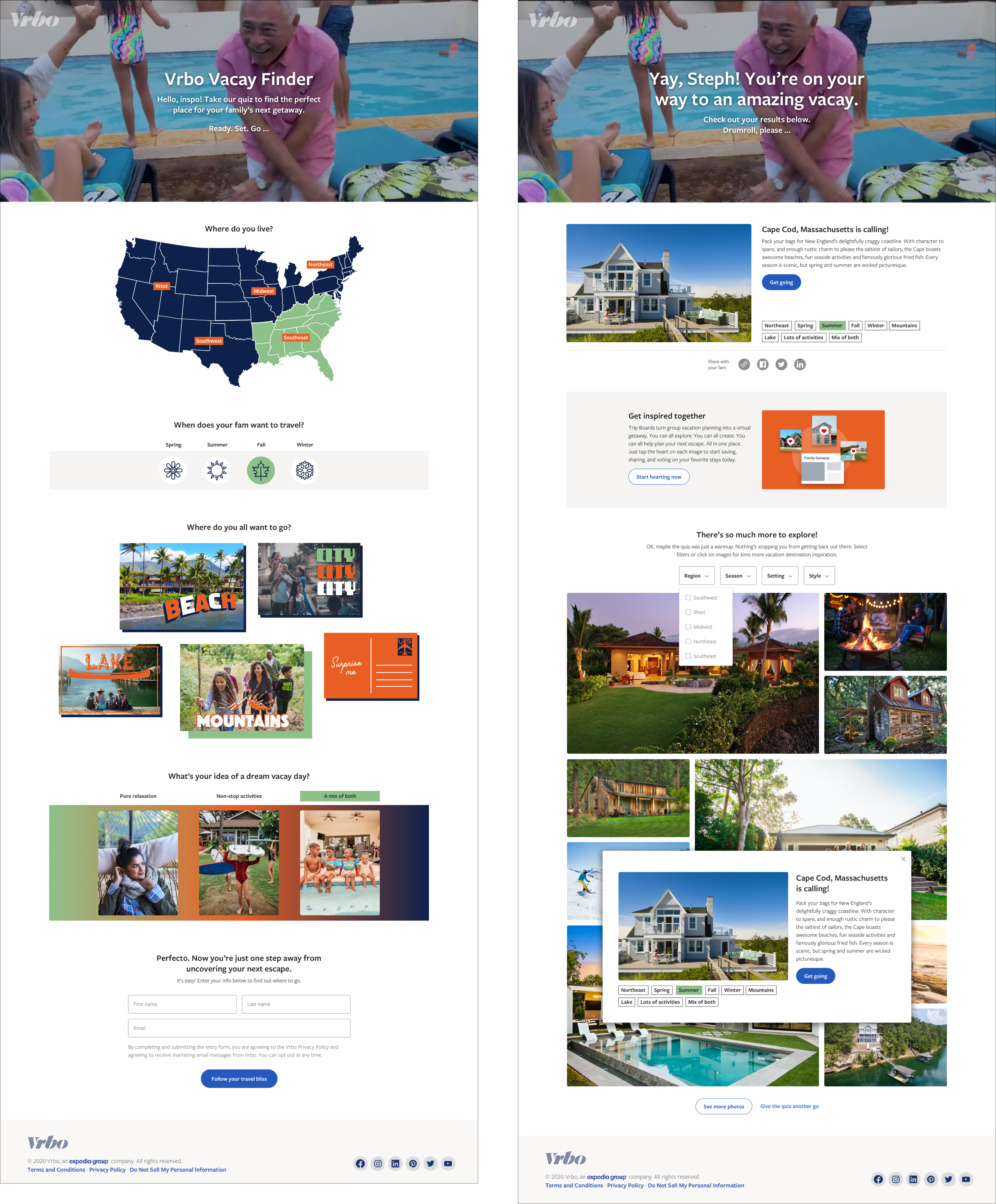
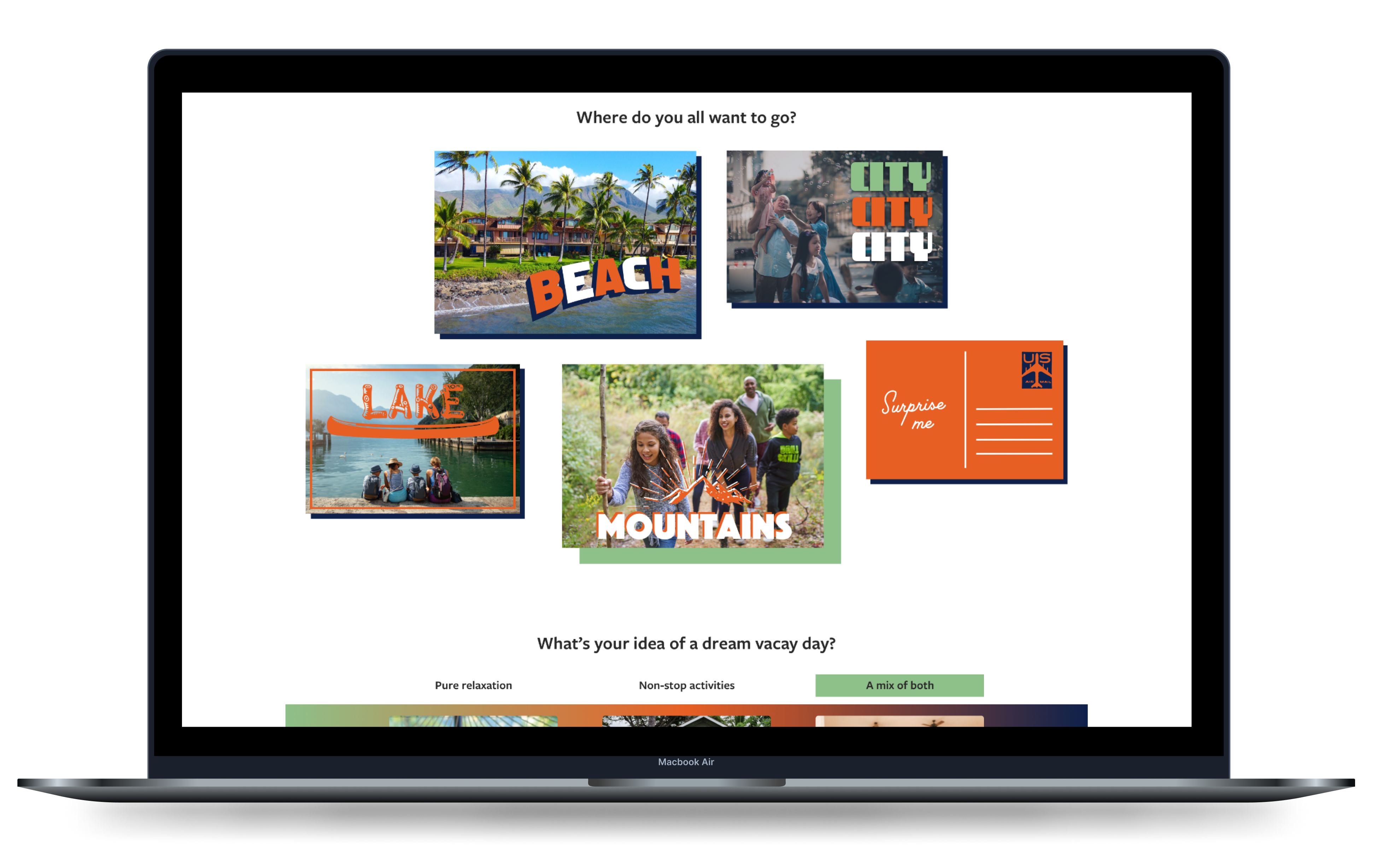
Desktop Mockups
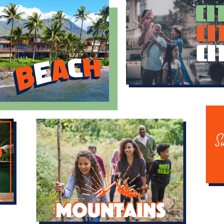
I was inspired by the idea of sending postcards while on vacation, so I designed the “Where do you want to go?” section to feel nostalgic with specialty typefaces and font treatments.
Error States
