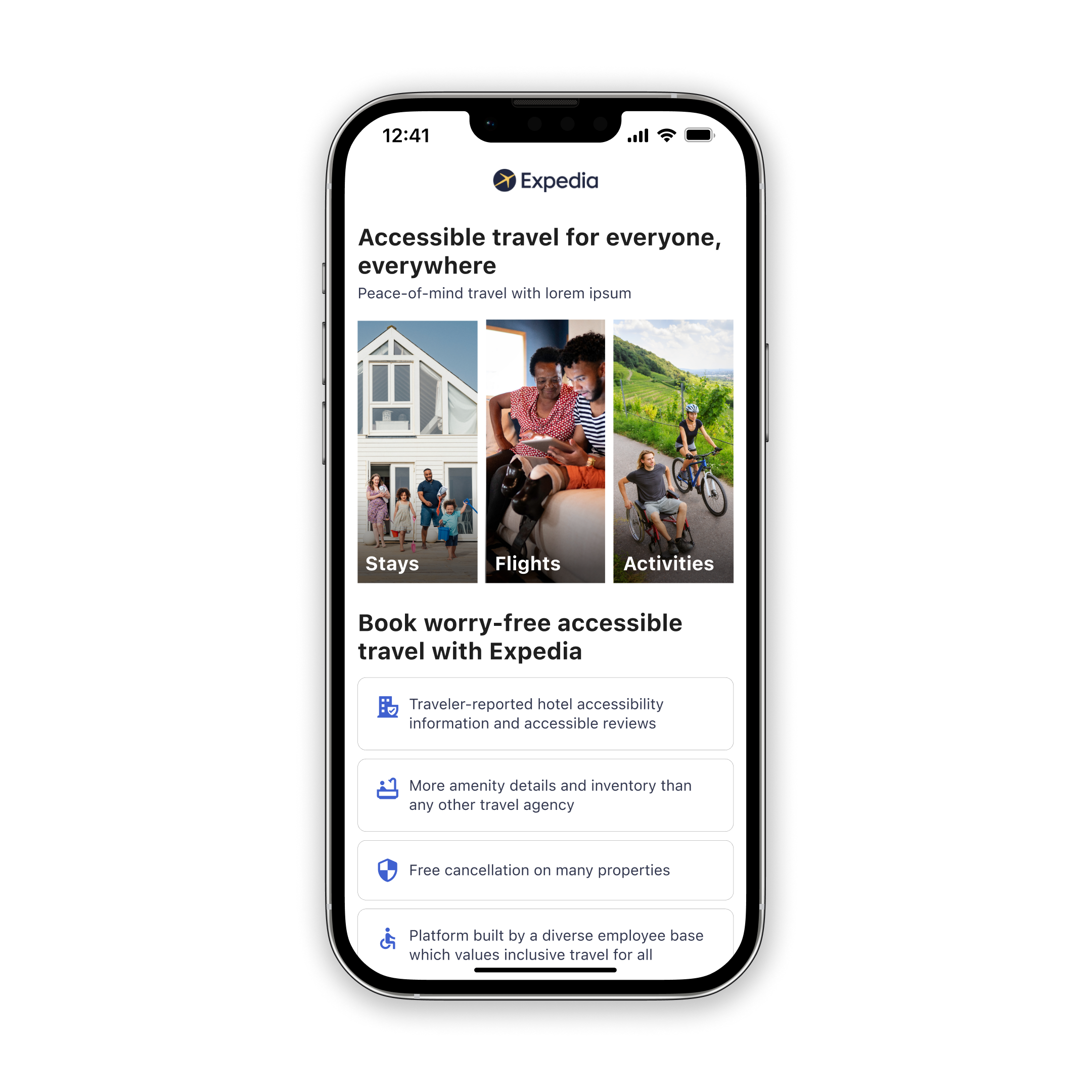
Expedia: Accessible Traveler Landing Page
Project Overview
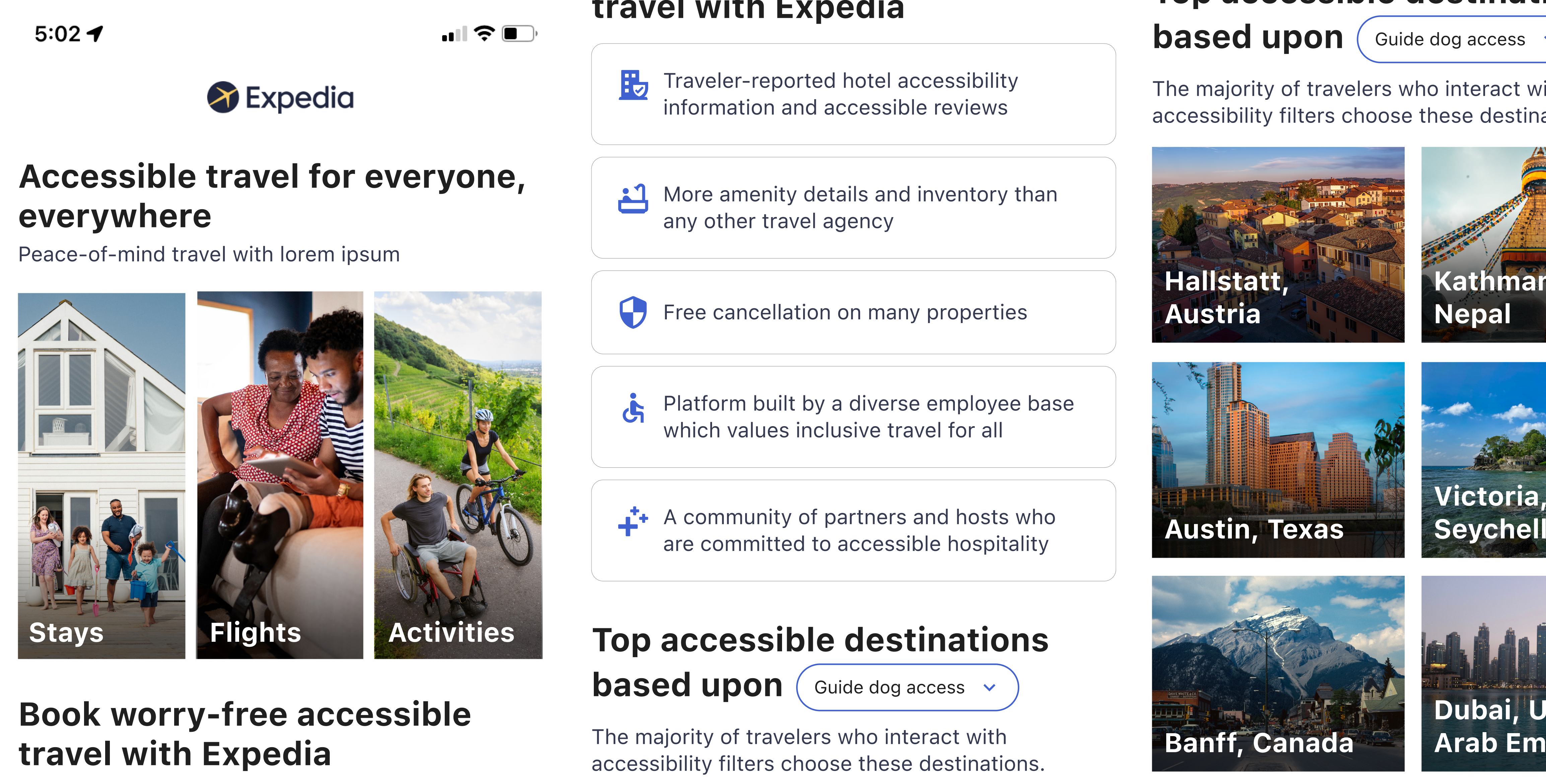
Expedia, an online travel agency, aims to power global travel for everyone, everywhere. As a part of Expedia’s Customer Inclusion and Diversity Experience Design team, I was tasked with creating a delightful and aspirational landing page for travelers with accessibility needs.
ROLES
Product (UX/UI) Designer, UX Researcher, Content Designer
Deliverables
Wireframes, prototypes, content design
Timeframe
Two week sprint



Customer Problem
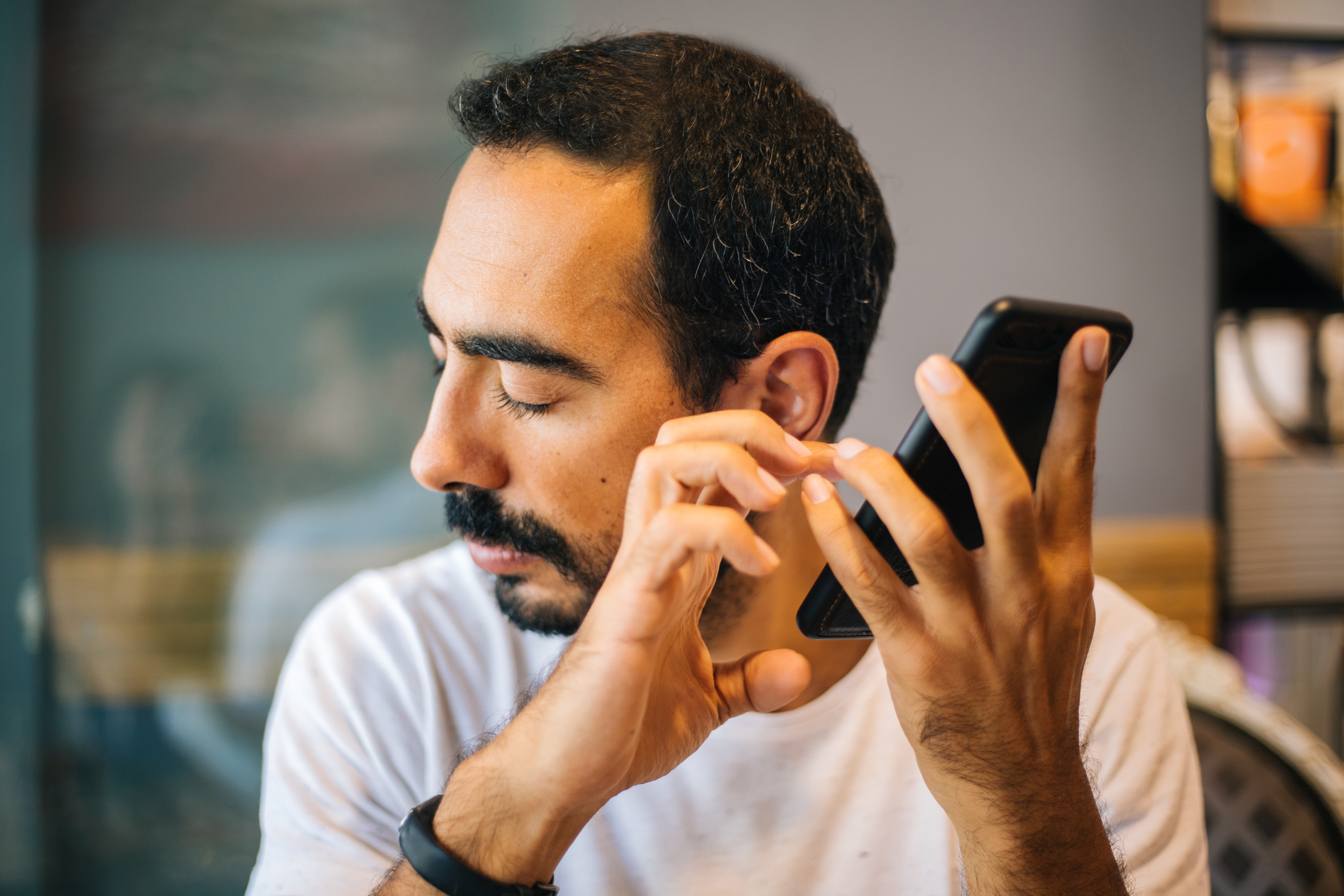
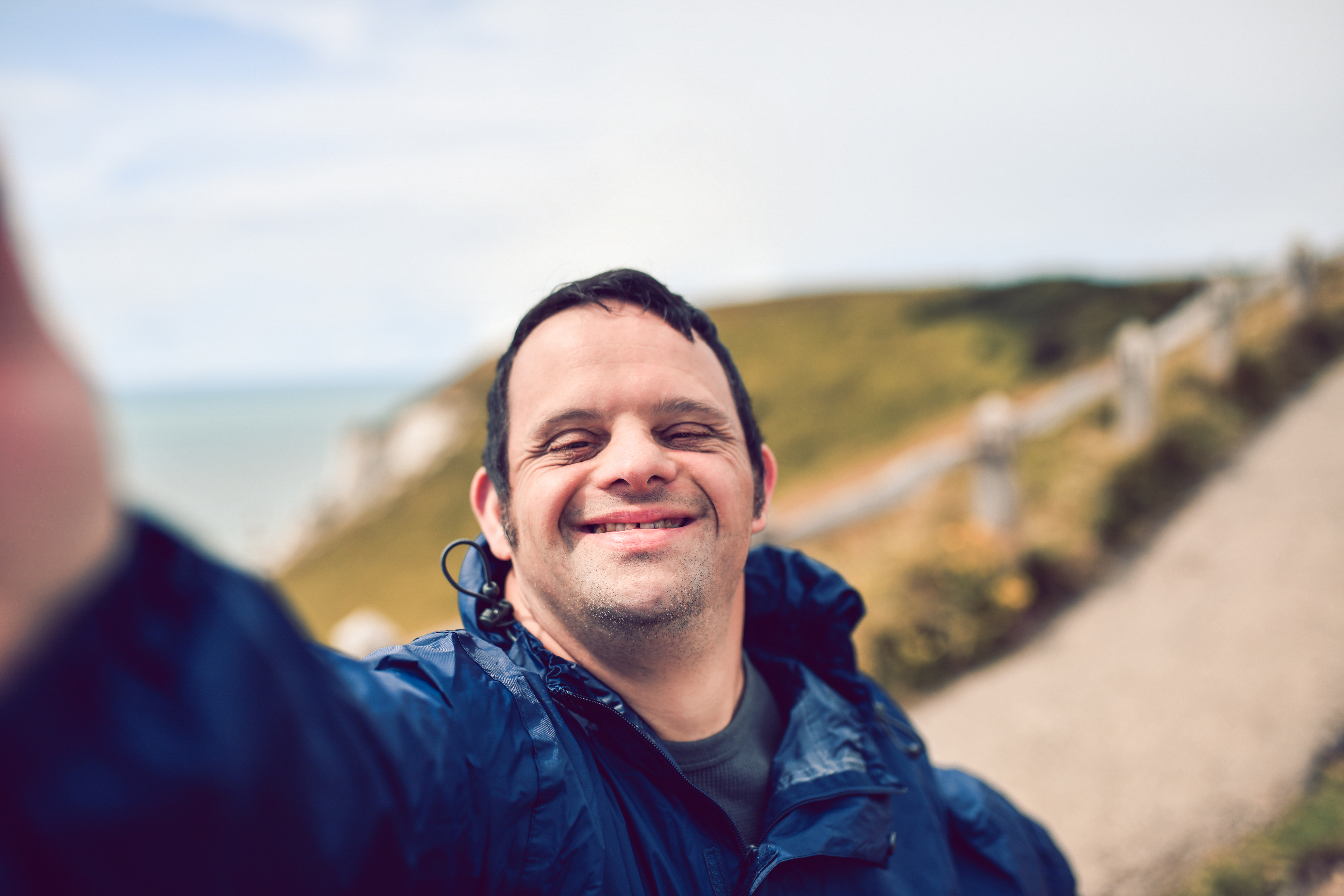
Travelers with disabilities do not trust Expedia’s website; it lacks complete accessibility and is incompatible with some assistive technology devices. Even if these travelers are able to successfully navigate and book an accommodation, flight, or activity through Expedia, they must still call the hotel, airline, or partner to confirm accessibility requests will be met. This extra step and resulting uncertainty generate a lack of confidence in Expedia as an online travel agency and a preference for reserving directly with the hotel, airline, or partner.
Highlights
Specialized accessibility design experience
As preparation for this assignment, I enrolled in Expedia’s Accessibility Champions program, wherein I was trained in the accessible design specialty. I learned about the latest WCAG standards and ARIA attributes; I attended workshops on designing, researching, and testing for situational, temporary, and permanent disability scenarios; and I interacted with assistive technology used across the disability spectrum.
Quick two-week sprint
In accordance with agile methodology, this project ran as a two-week sprint. This was based on the idea that a repeatable, two-week process generates constant, iterative, and fast UX/UI design.
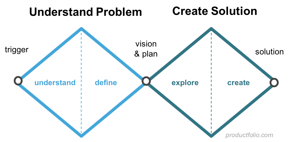
A Double Diamond and Google Sprint mashup
Elements of both the Double Diamond design model and the Google Sprint problem solving formula informed my solution-finding process. These mechanisms helped me organize my thoughts in order to improve my creative output.
Scenario
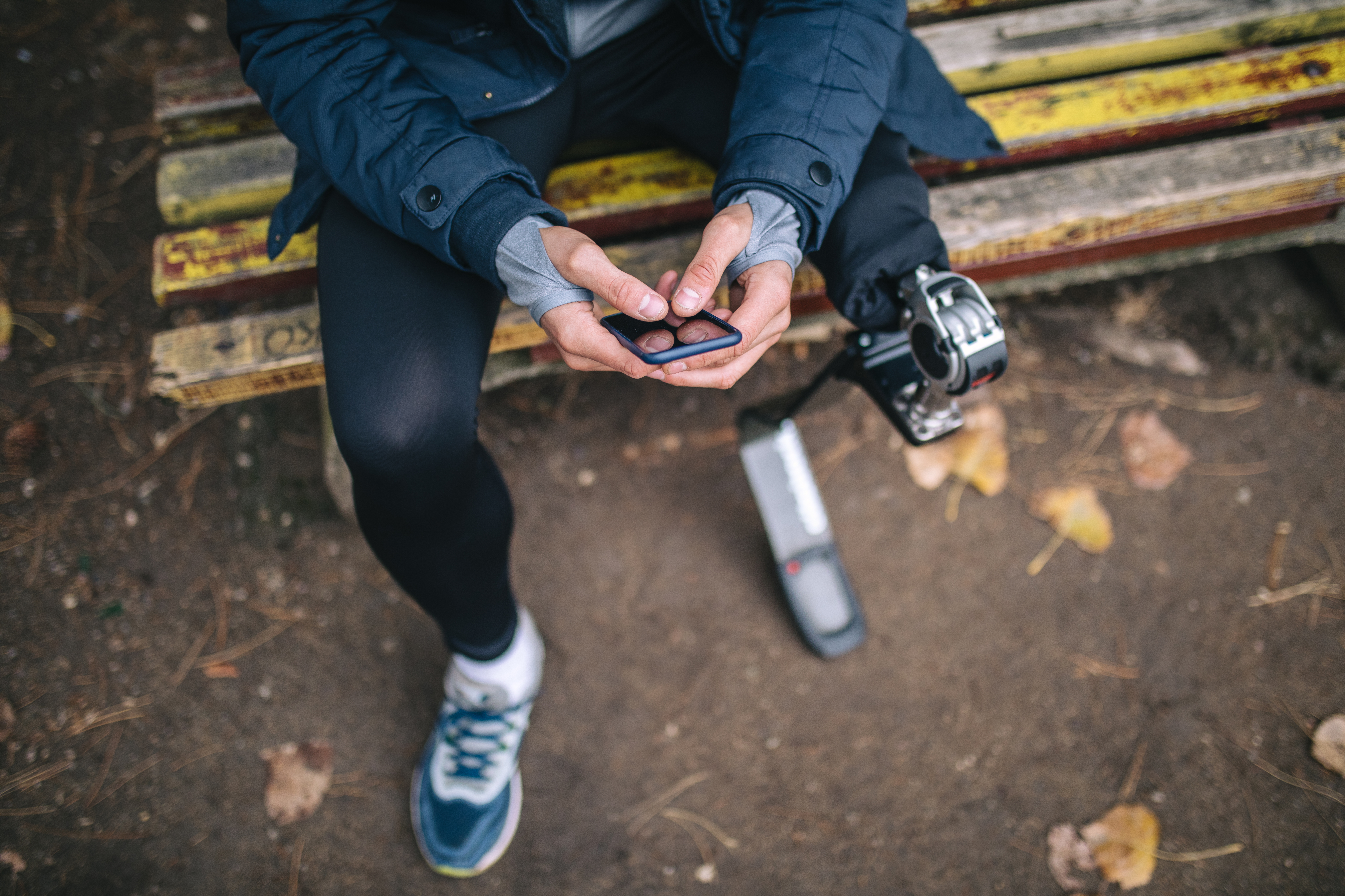
- You are a wheelchair user from Austin, flying to New York for a week, with your partner who is partially blind.
- You are both using mobile devices to plan the trip.
- Neither you nor your partner has been to New York before.
- Your trip is from Saturday 16th November to Saturday 23rd November.
- You both are looking for a suitable flight, a suitable hotel, and a suitable activity to do in the area during your stay.
Day 1
Understand User Needs & Requirements
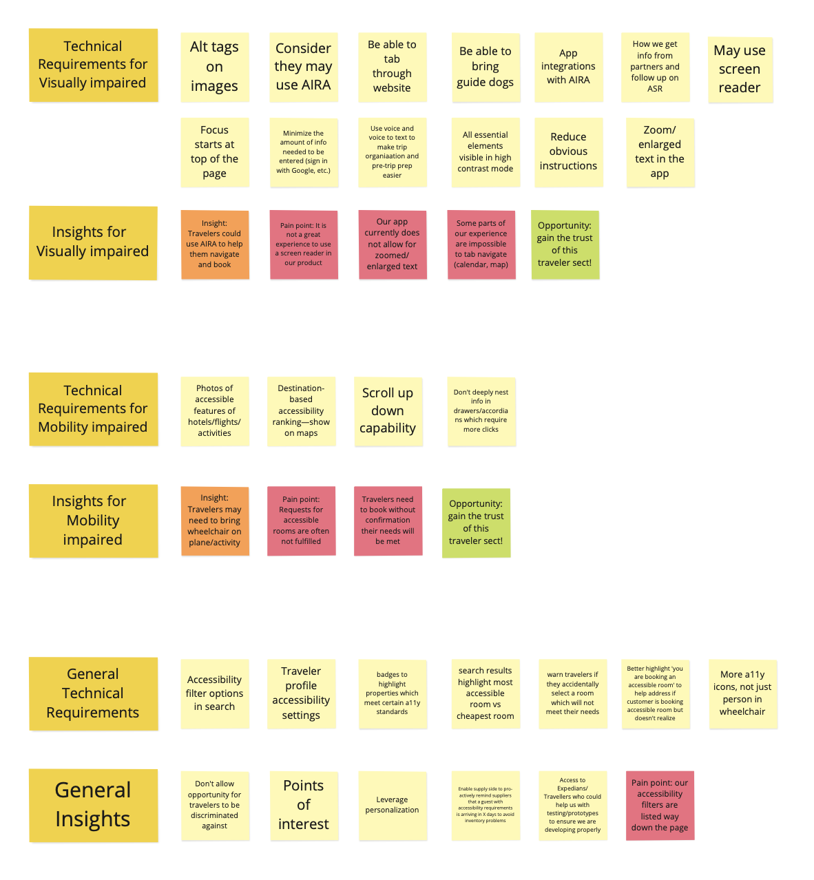
I gathered technical requirements and general insights for travelers with visual impairments and travelers with mobility impairments. In order to glean this information, I read through hundreds of pages of third-party accessibility audits solicited by Expedia, researched first-hand accessible travel successes and mishaps on blogs, and had a lot of conversations.
I interviewed key stakeholders, one of whom was a traveler with disabilities, our target persona.
Day 2
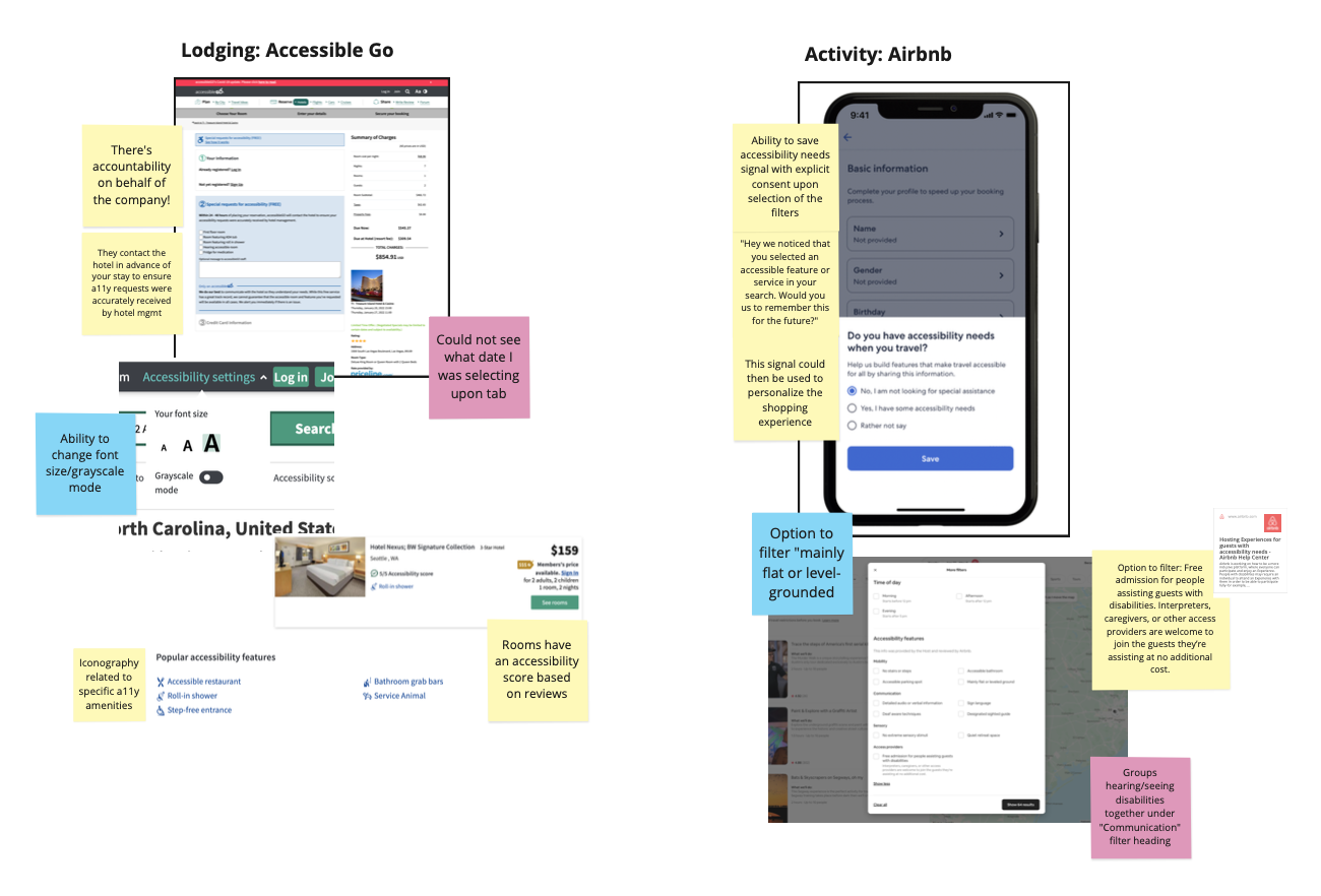
Competitor & Comparative Audits
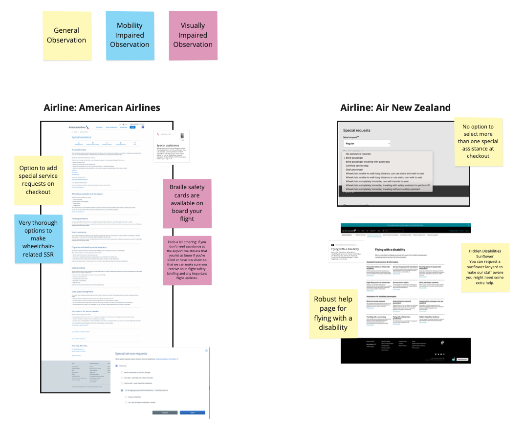
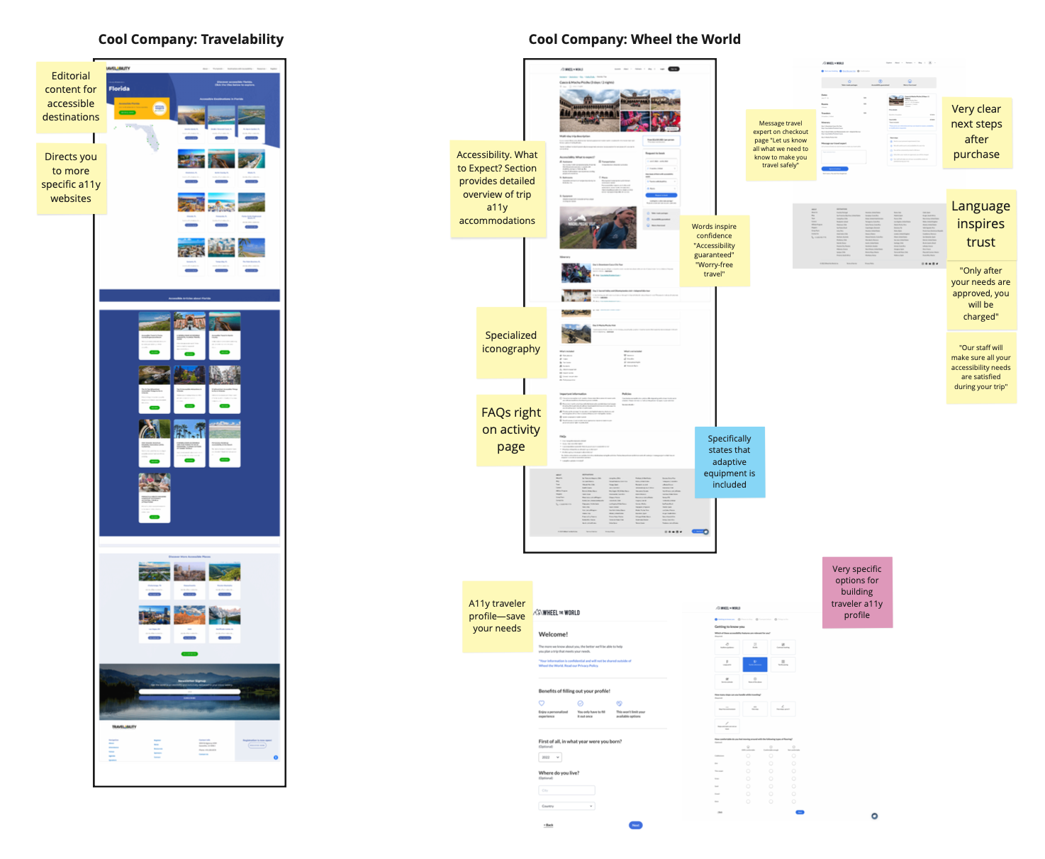
I researched other lodging, airline, and activity companies and made general observations, observations from a mobility-impaired standpoint, and observations from a visually-impaired standpoint.
Day 3
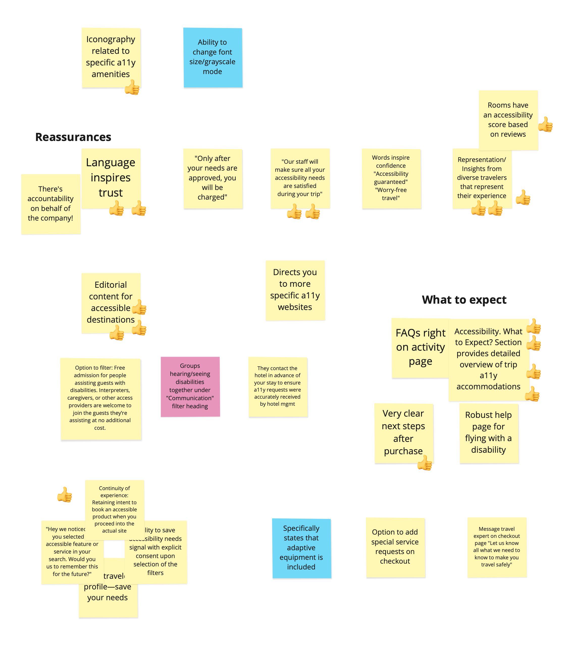
Group & Prioritize Findings
I gathered stakeholders and teammates in a workshop to share my findings and vote on the best opportunities for surfacing a suitable hotel, flight, and activity.
Day 4
Map Out Interaction Requirements
I established a journey map to understand the entry and exit points of this landing page. I defined several ways users with accessibility needs could discover this page and where it would lead them.
Day 5
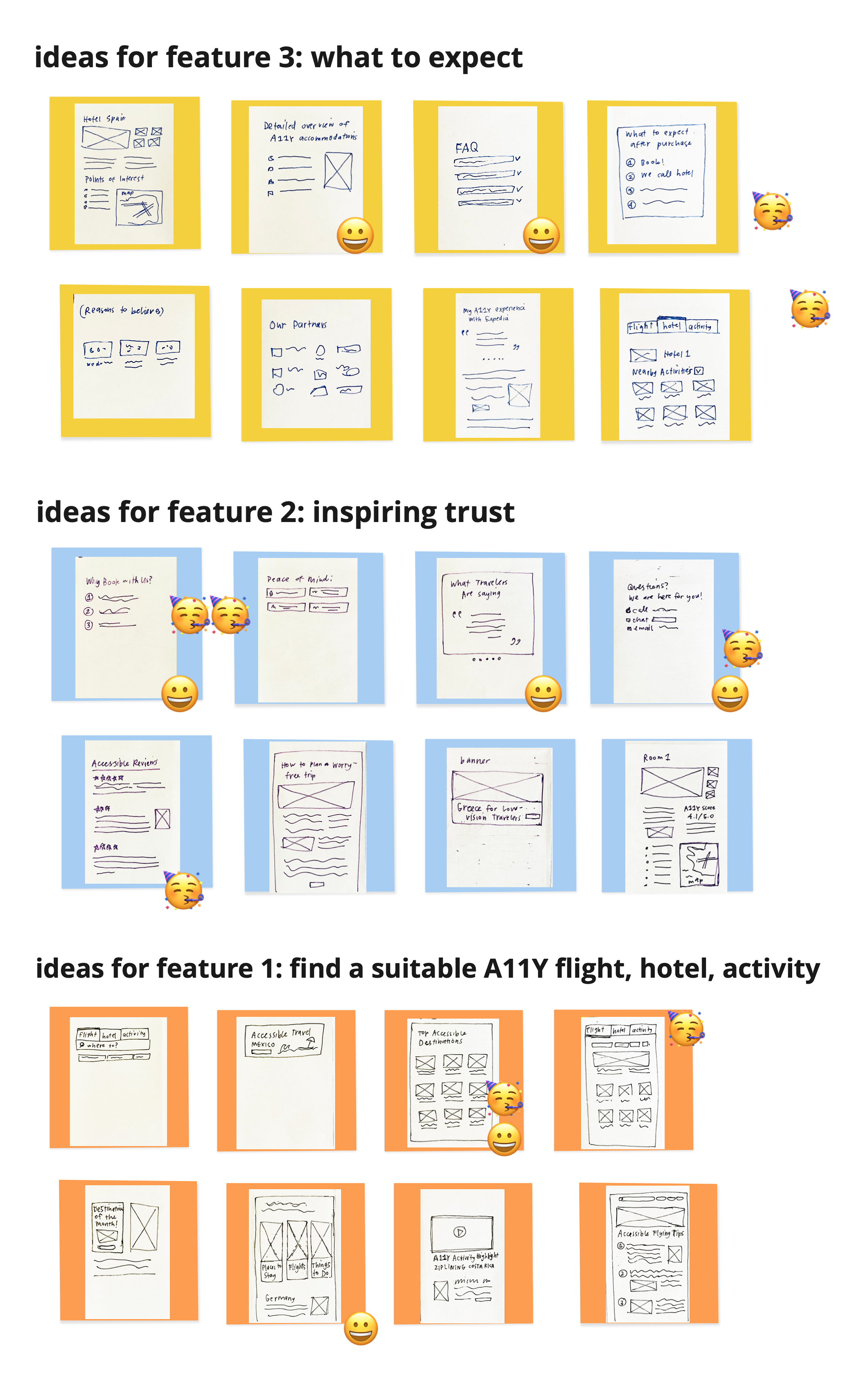
Crazy 8s Sketches
Crazy 8s is a rapid sketching exercise in which I was challenged to draw eight distinct ideas in eight minutes. The goal was to think past my initial design idea and generate a wide variety of solutions.
I performed a Crazy 8s exercise for the following themes:
- Find a suitable accessible flight, hotel, and activity
- Inspiring trust
- What to expect
Day 6
Present Top 2 Ideas For Each of the Three Themes
I once again gathered stakeholders for a workshop to vote upon which themes were strong enough to move onto the wireframing stage.
Days 7–8
Build High-Fidelity Wireframes
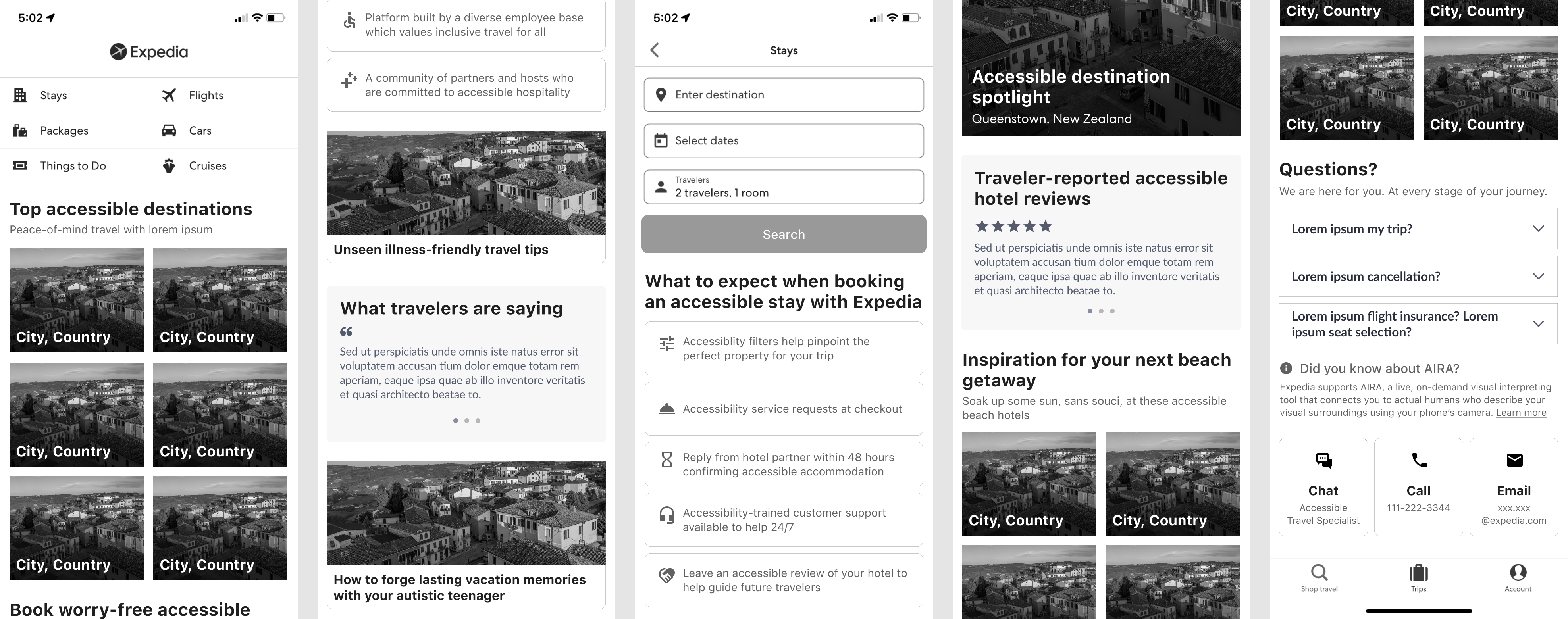
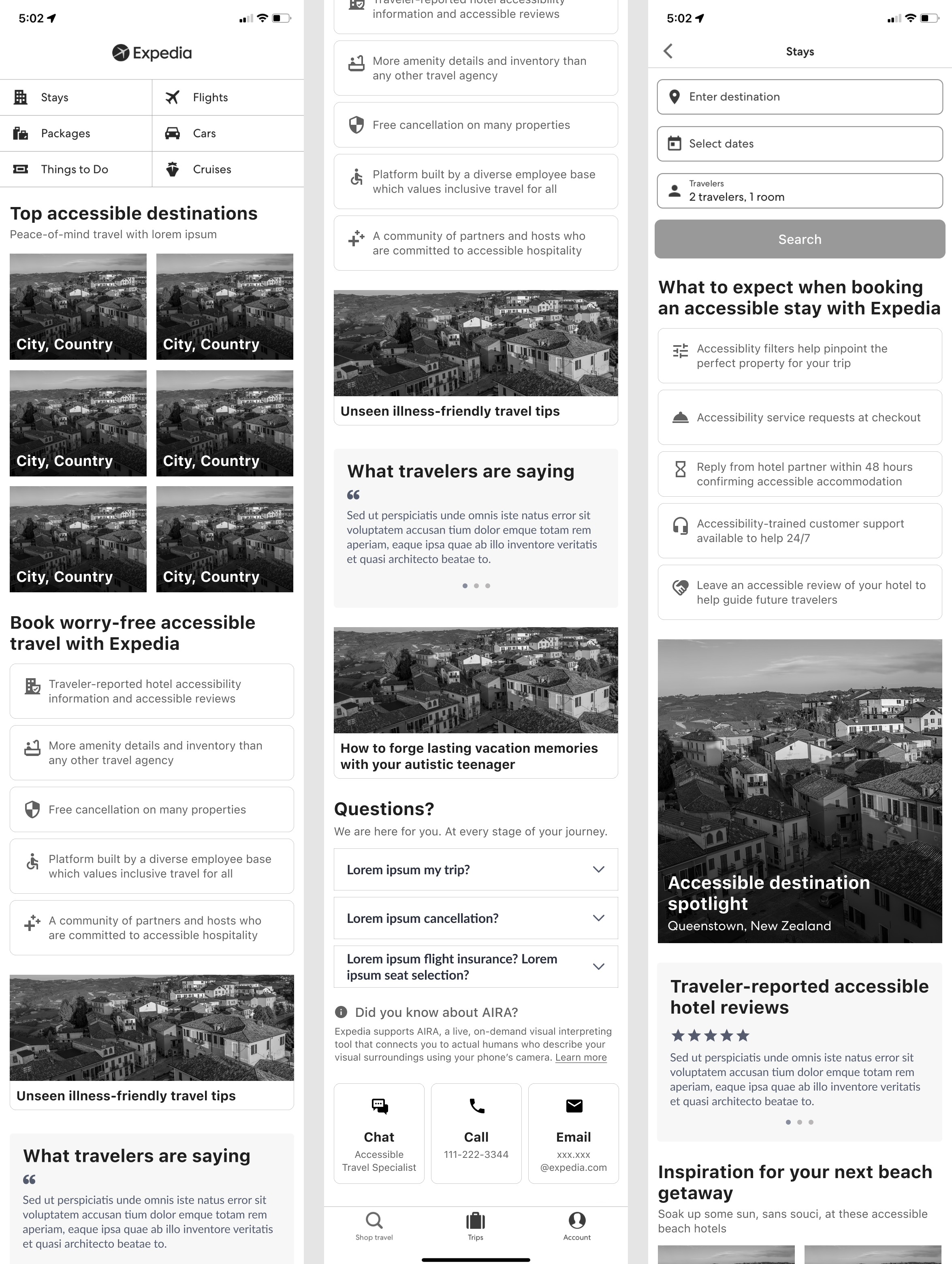
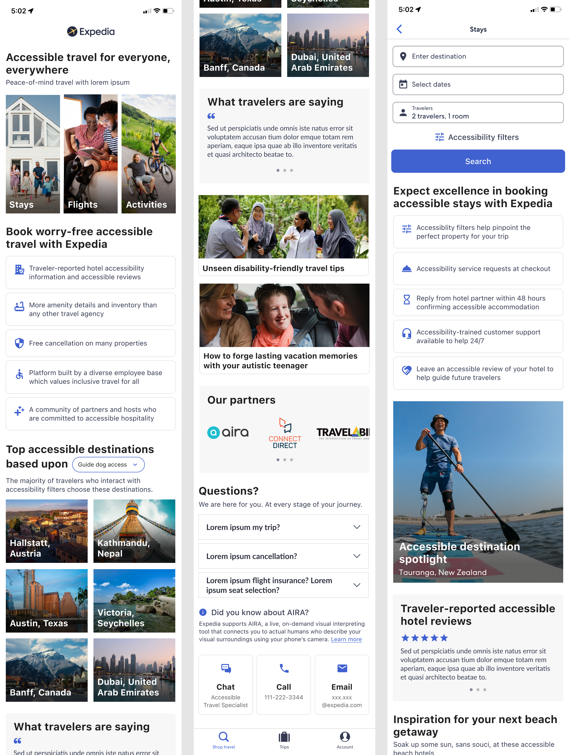
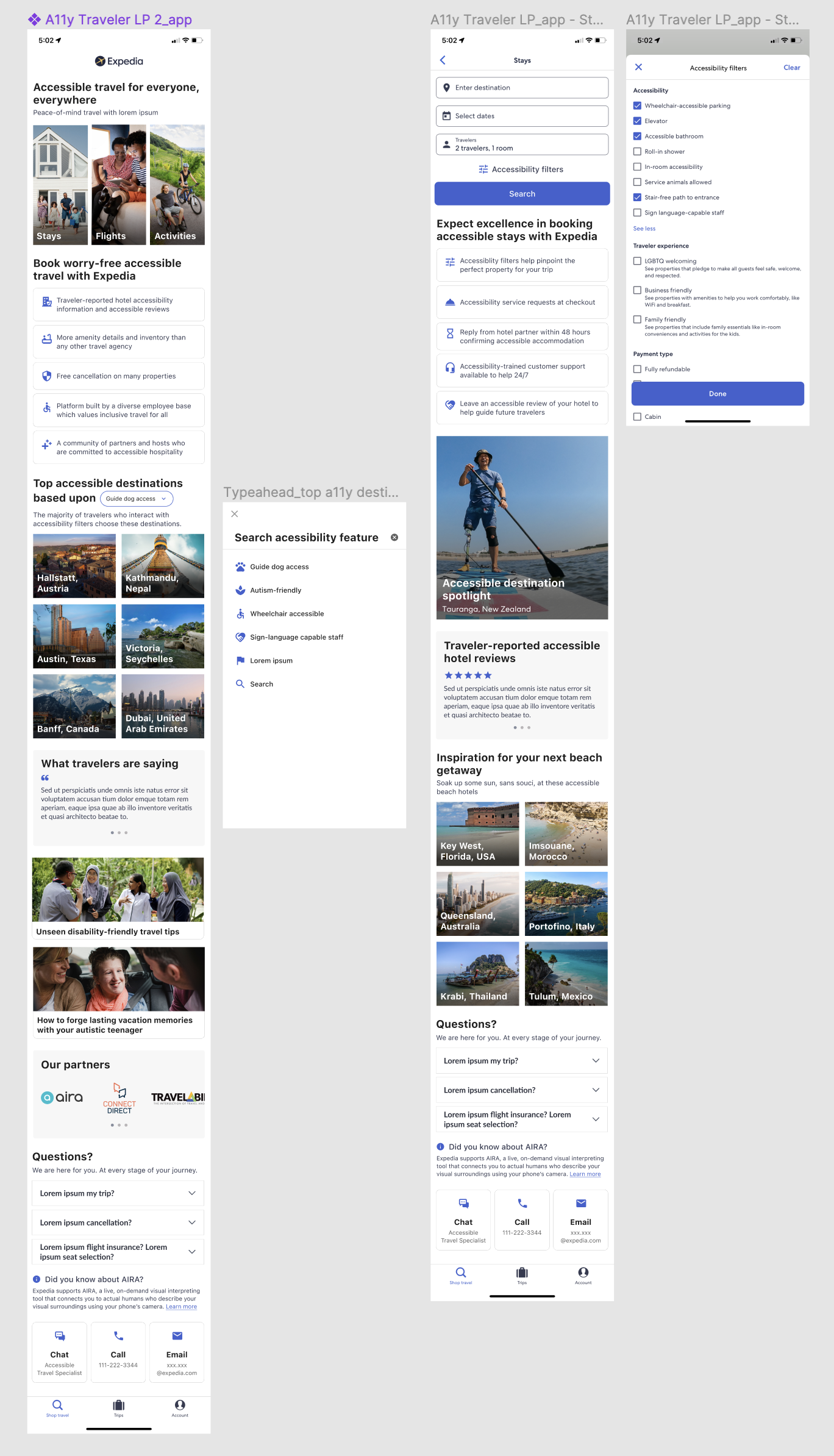
Focusing my breakpoint for this design sprint on Expedia’s mobile app, I utilized some existing design system components while adapting others to build first-stage wireframes. I was responsible for all written content on these wireframes.
Day 9
Present & Test
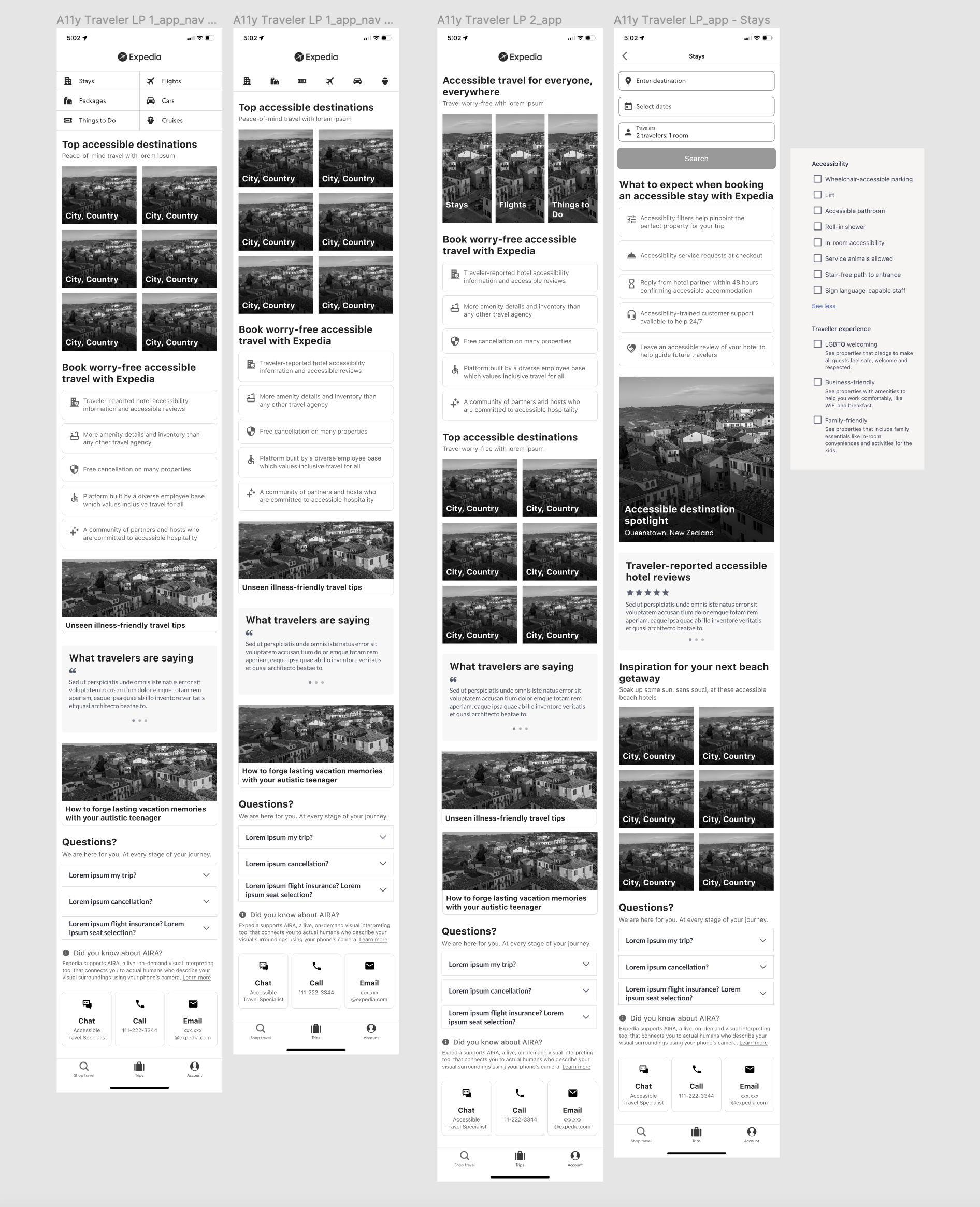
I shared my work with my colleagues and stakeholders and compiled valuable feedback. Were this not my first design sprint for the Accessible Traveler Landing Page, I would have also conducted user testing at this stage.
Day 10
Build Mockups
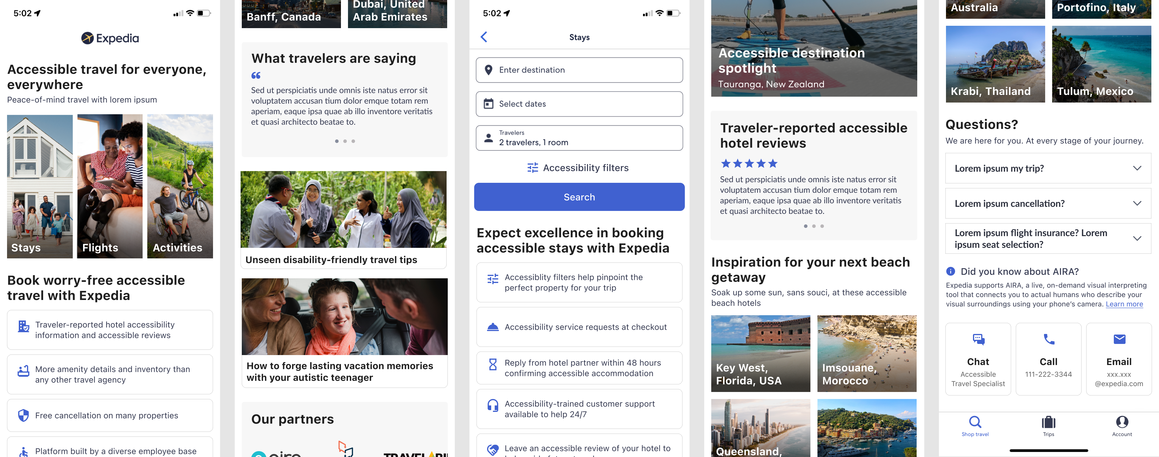
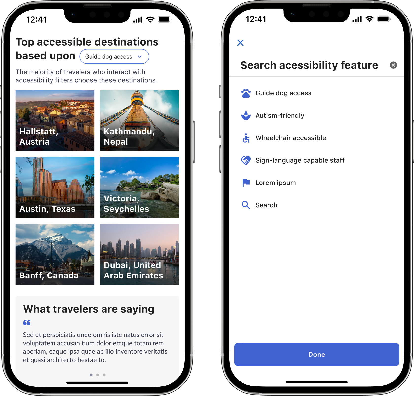
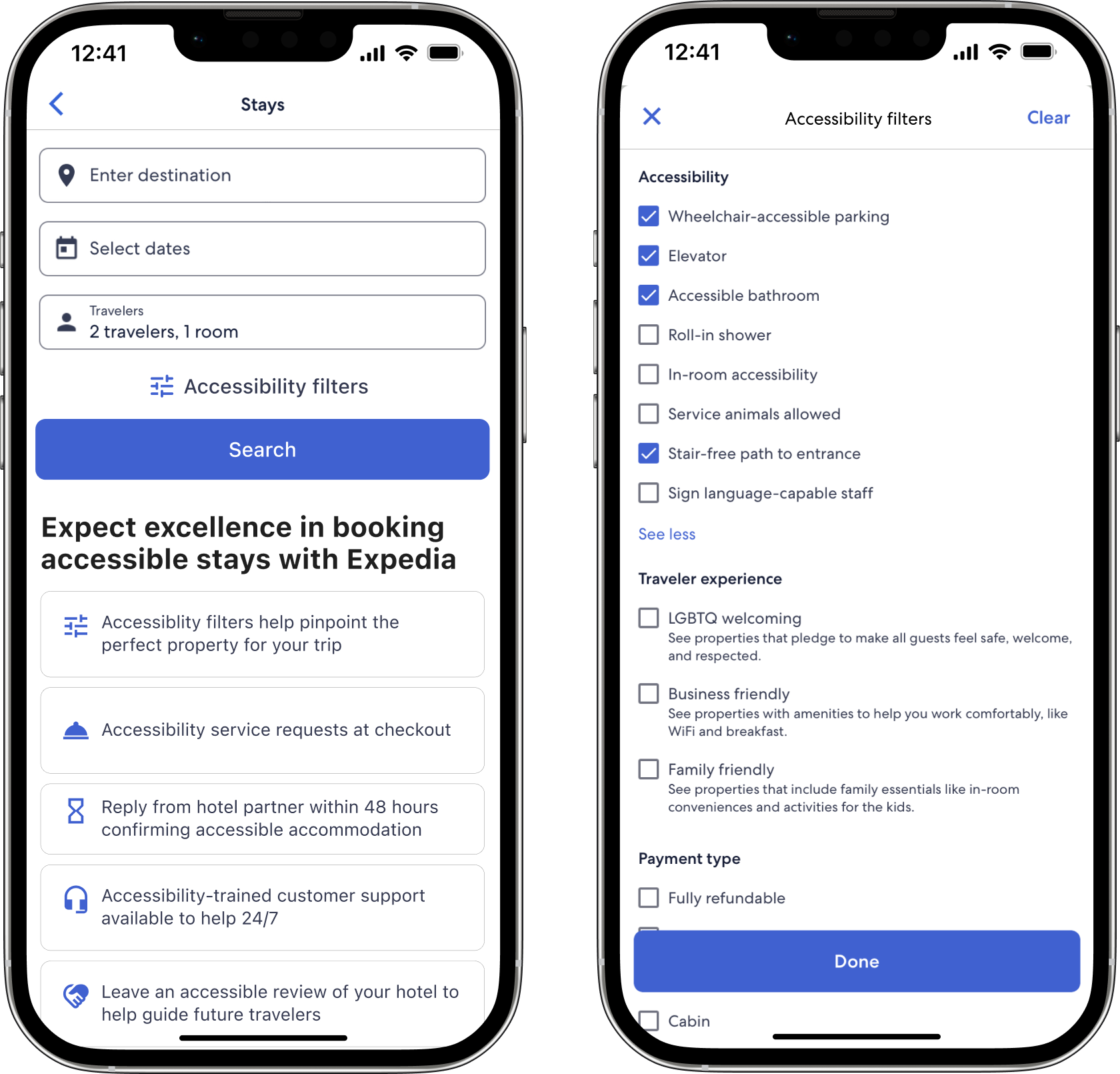
After studying the observations and suggestions of my colleagues and diving back into my initial research, I implemented changes to my wireframes. I sourced inclusive and diverse photos and added design system colors to my mockups.
Next steps and iterate
- Expedia’s app team is redesigning the top nav grid for the six lines of business. Reconsider how this affects the scalability of the tabbed approach.
- How would this page change if a traveler arrived here from a Google search? What relevant content could logic load?
- What is the logic around which destinations are “top accessible?” Add a dropdown filter for travelers to customize content.
- Add accessibility filters directly to the main search to eliminate user friction.
- Content design: reconsider wording in headlines to inspire more confidence.
