The Framebuilders: Web Accessibility Annotations
Project Overview
Accessibility is everyone’s responsibility. However, accessibility is often overlooked in product design, requiring more effort and time to find and remediate issues that arise. If problems are not found before the site has been released, it can cause substantial strain—even rendering interaction with a site impossible for some users.
As a part of my continual professional development, I reviewed some of my past freelance work for accessibility bugs. The Framebuilders is a brand and website I designed for a client in 2018. Below you will find The Framebuilders site annotated with accessibility measurements.
ROLES
Product (UX/UI) Designer, Accessibility Consultant, Brand Designer
Deliverables
Accessibility annotations, wireframes, prototypes, logo, brand design
Timeframe
Two days
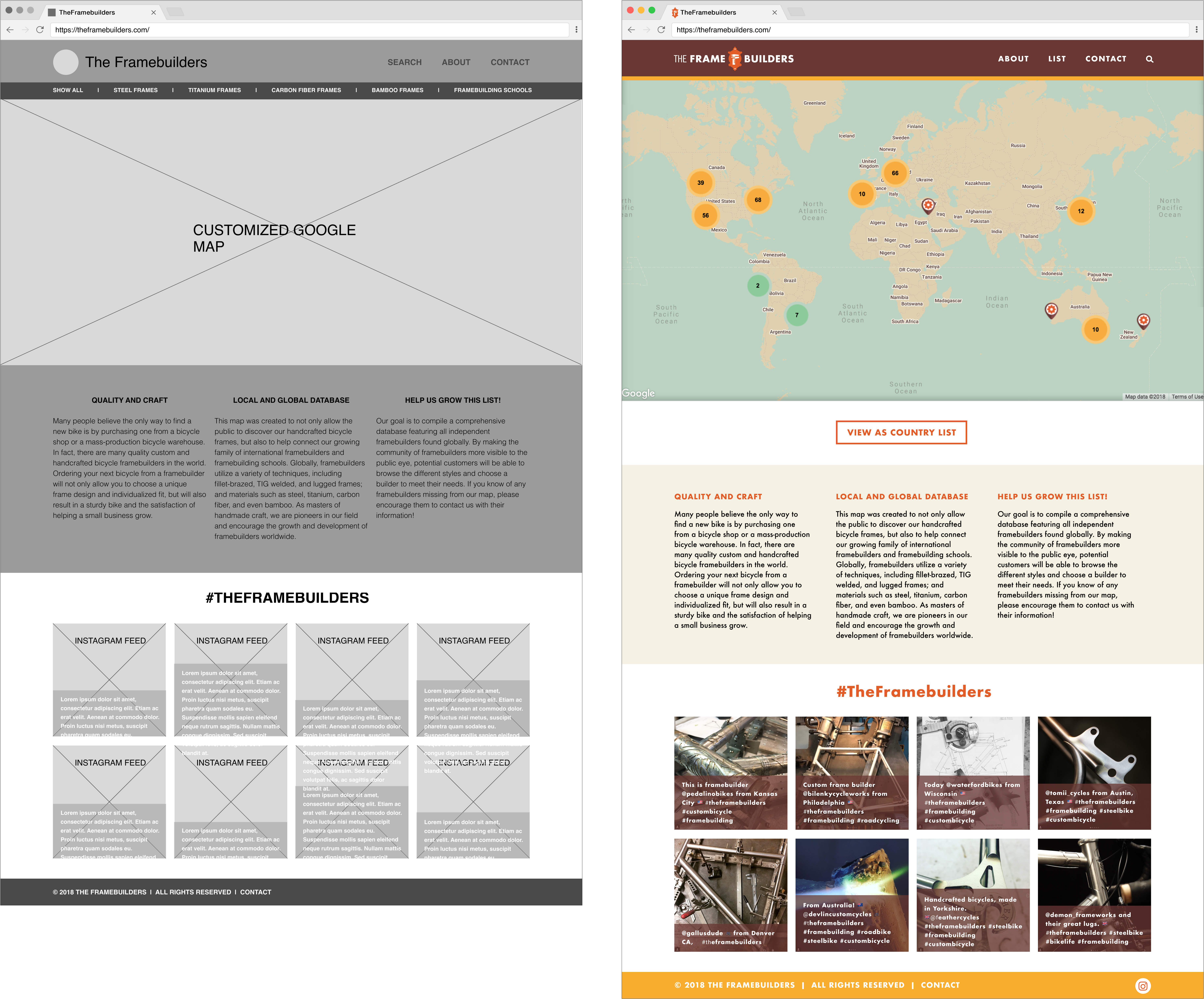
Before Accessibility Annotations
Wireframe & Mockup
After Accessibility Annotations
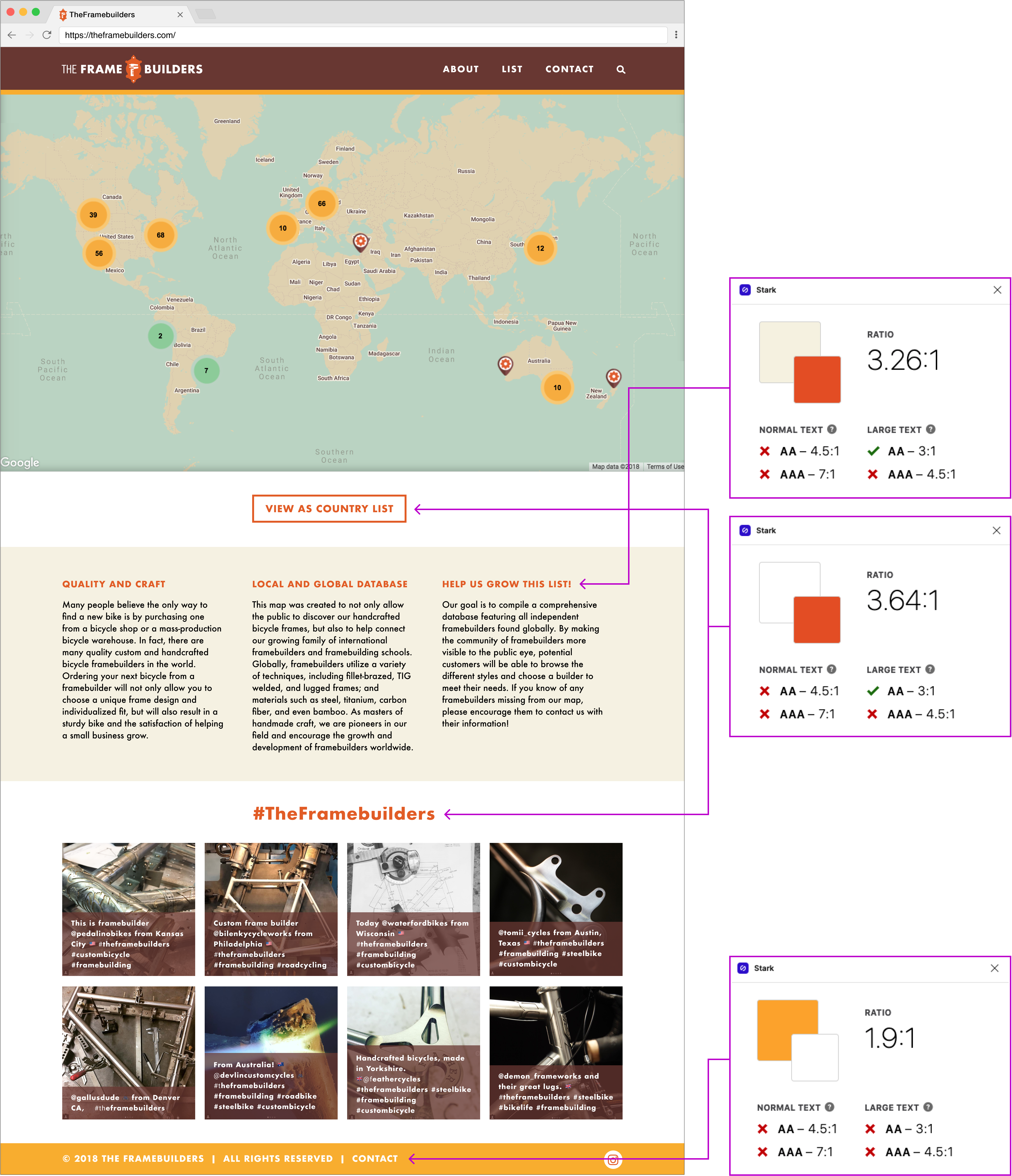
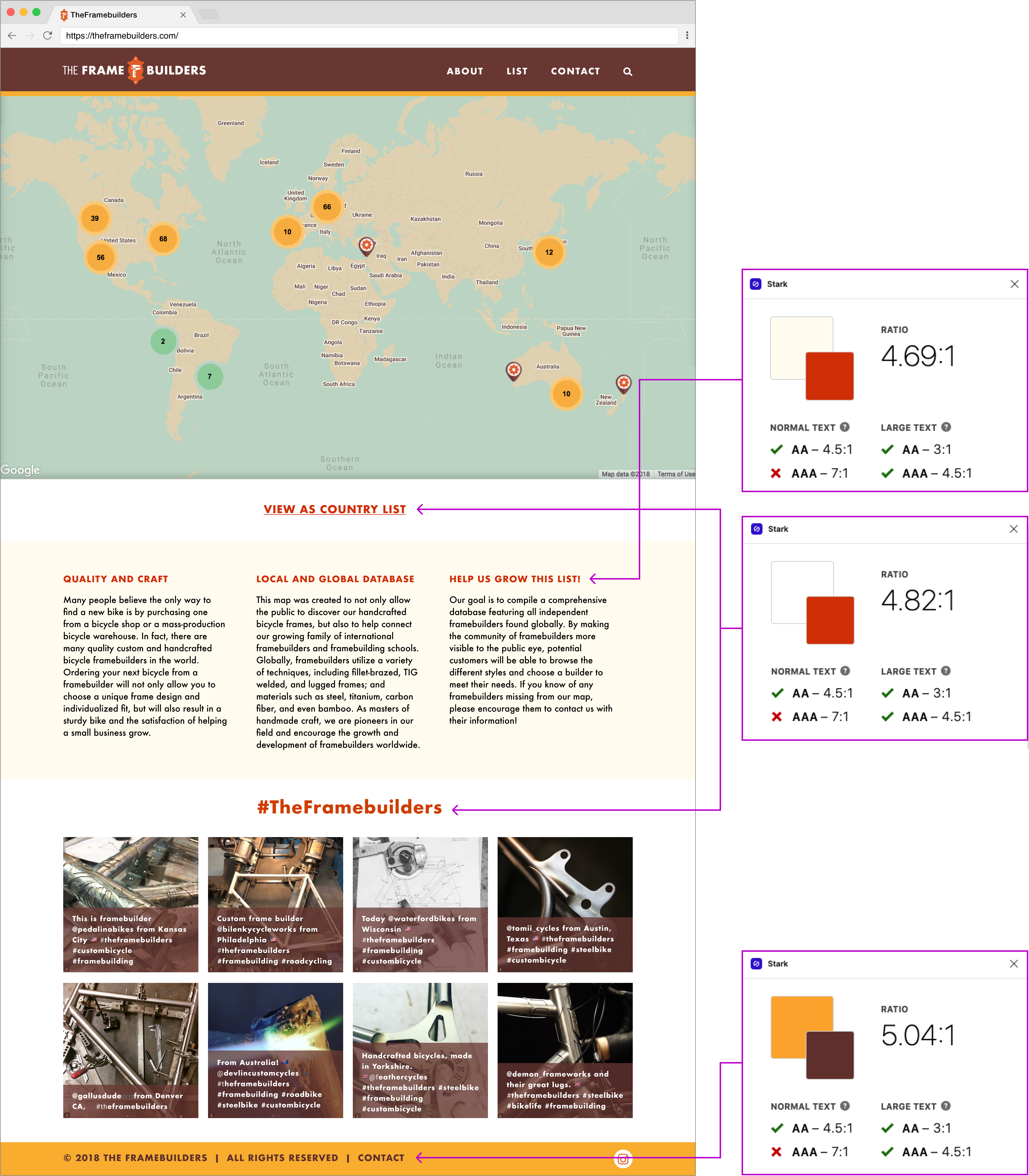
Color Contrast
Across my design, I noticed my color palette did not maintain a contrast ratio of at least 4.5:1. I replaced failing colors with tones that achieve at least level AA per WCAG 2’s Contrast Ratio.
After Accessibility Annotations
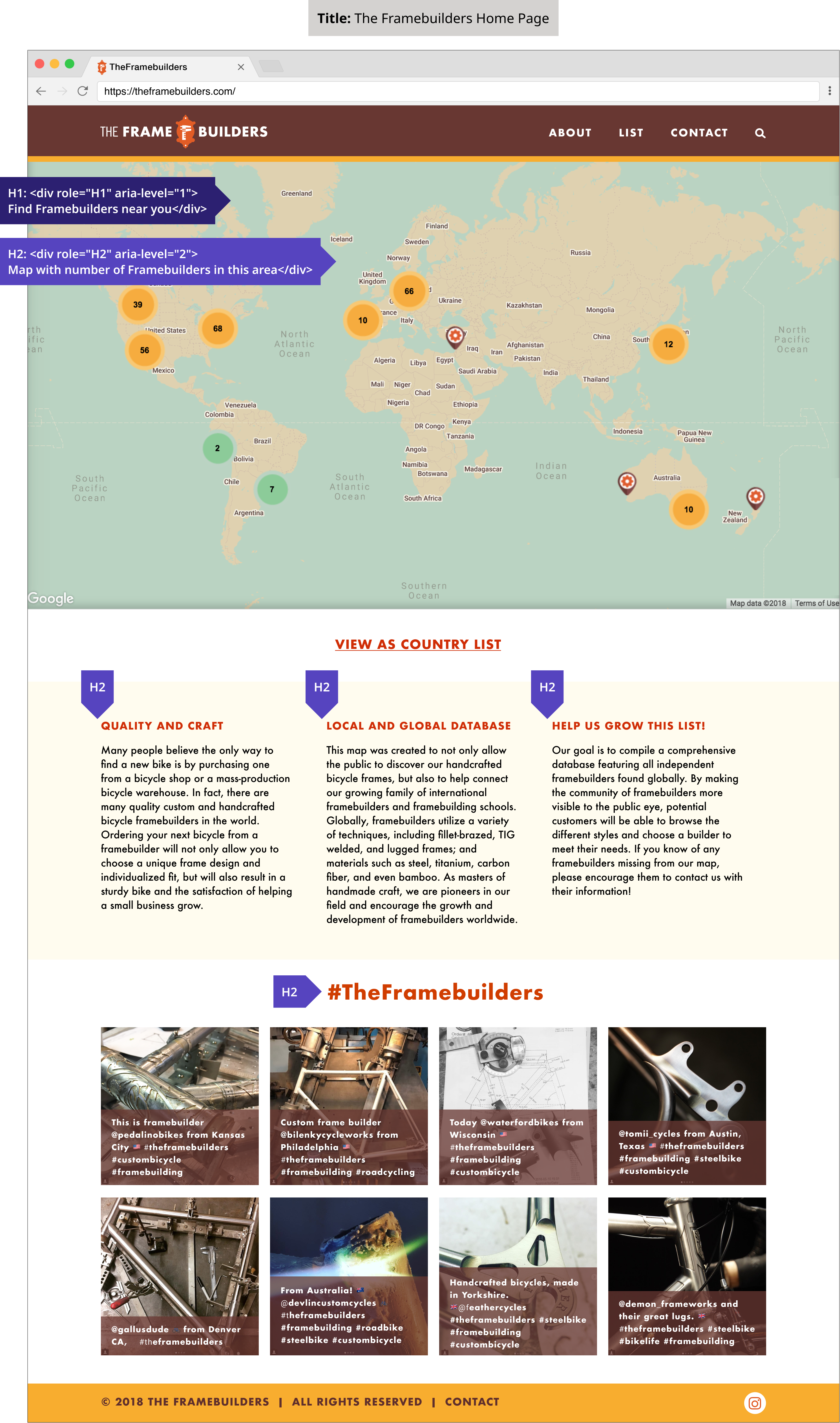
Page Title & Headings
Page titles allow users, especially those using screen readers, to understand what to expect on a page.
Headings dictate the architecture of a website. Headings help both sighted and screen reader users to quickly scan for information on a page. Some headings look like visual titles, others are hidden but can be read by a screen reader. It is important for designers not to select heading levels based on their appearance or character style; rather, headings should reflect the page hierarchy.
After Accessibility Annotations
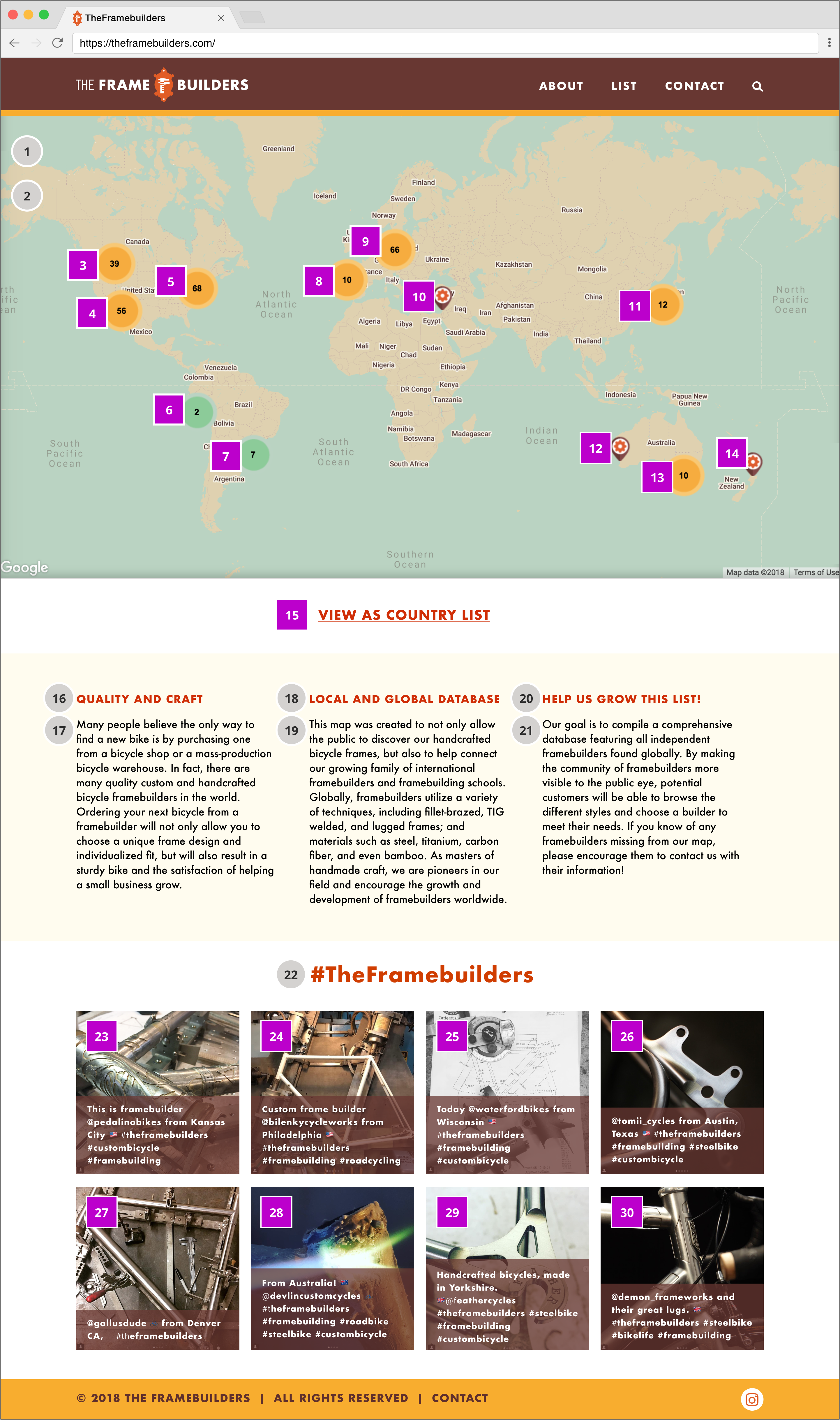
Reading Order & Focus Order
The reading order dictates the order in which the screen reader will speak the content. The focus order determines the order of interactive (“clickable”) elements. The focus order is navigable by using the tab key.
For this documentation, I used gray circles to indicate objects’ reading order and purple squares to indicate elements that receive focus.
After Accessibility Annotations
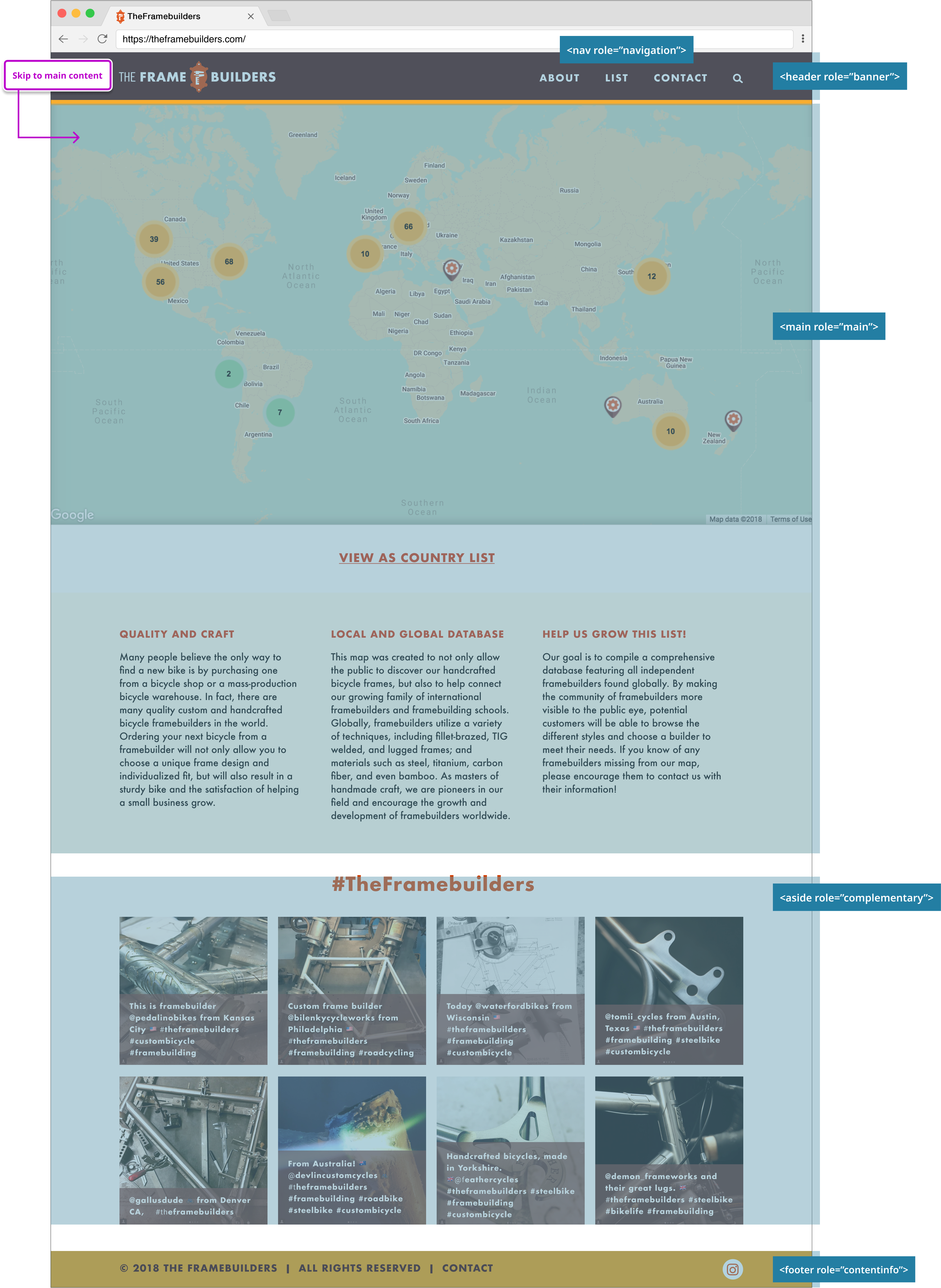
Skip Navigation Links & Landmarks
The main content of a website is not usually the first information presented in the layout. For example, many websites feature a logo, menu bar, account login, and search box at the top of the page. The Skip Navigation Link allows users of screen readers to access the main content of the website without having to keyboard tab through the header navigation every time.
Landmarks are subsections of the page, representing commonly occurring blocks of content. They help users of screen readers orient themselves to a website, notifying them of the structure and allowing them to skip between sections. Landmarks are visually hidden but can be read by screen readers.
After Accessibility Annotations
Buttons & Links
Links and buttons are not the same. Buttons are used for actions that trigger an action like opening something or sending a form; links are used for navigation to a new page or a section within the same page.
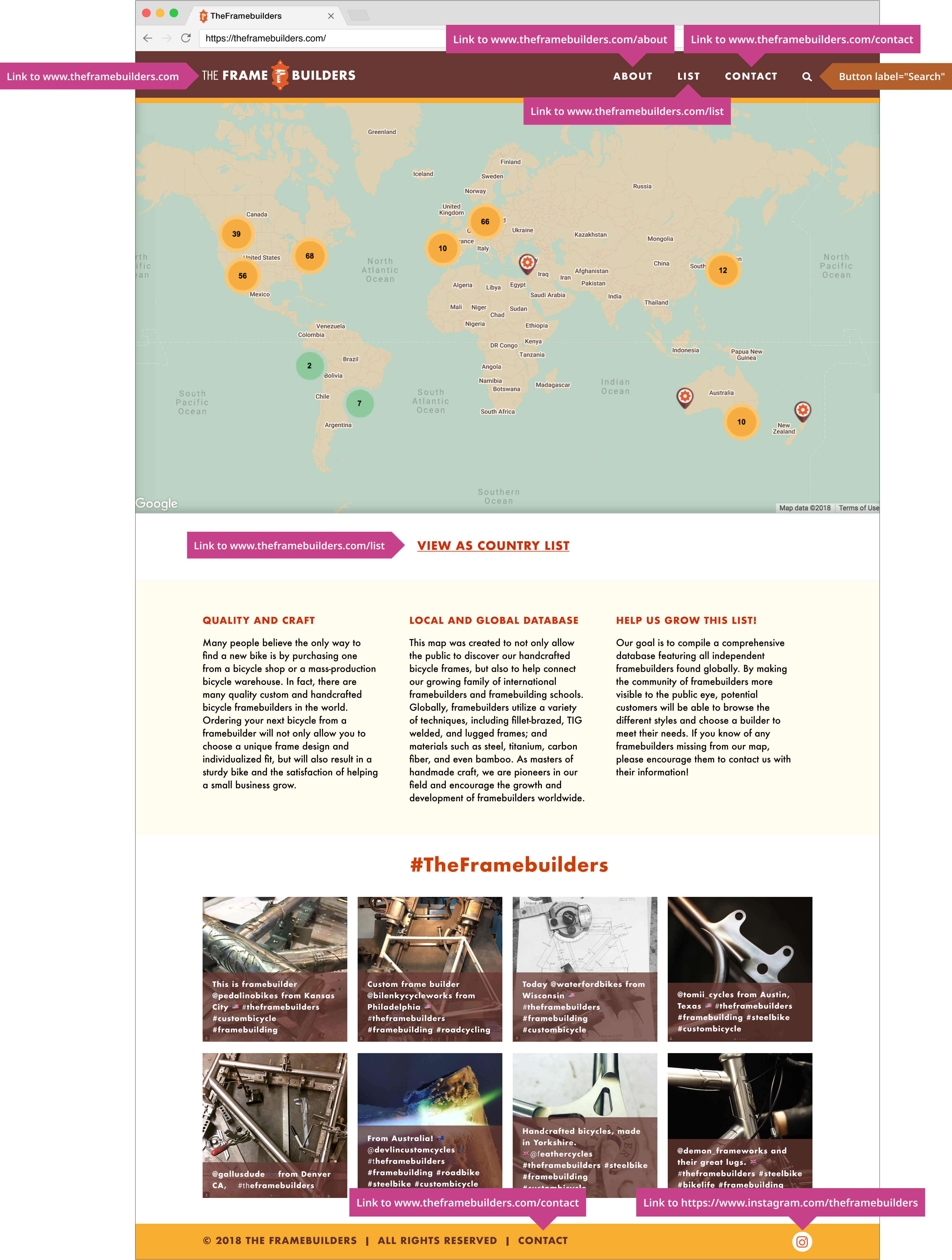
Once I better understood that difference, I realized the “View as Country List” UI from my original design was a link disguised as a button. It was a needlessly confusing design element, so I removed the box surrounding the text and added an underline instead.
Some screen reader users may prefer to browse the content on a page by hearing a list of all available links and buttons. Properly annotating links and buttons enables these users to skip more quickly around the page.
