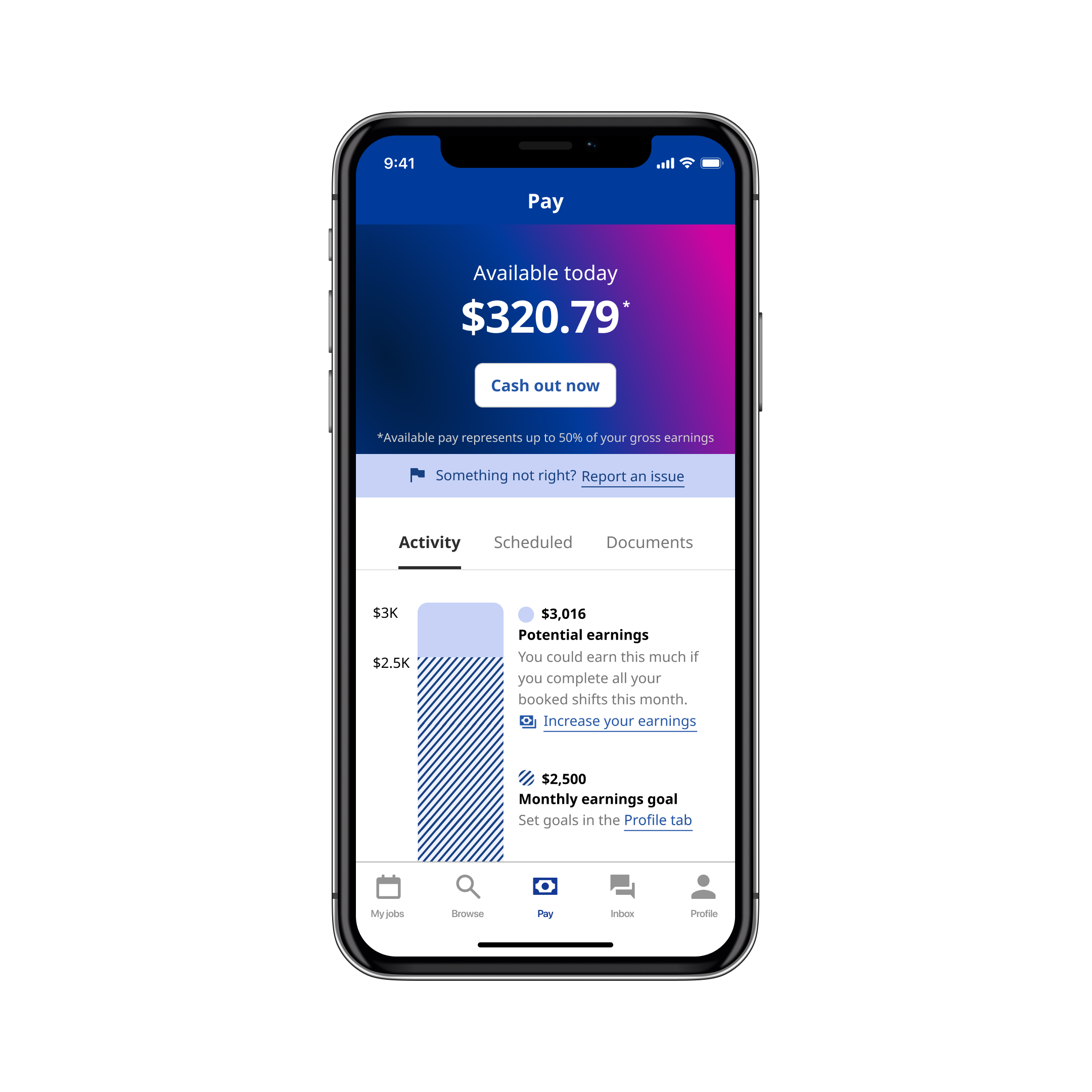
Indeed: Instant Pay Web App
Project Overview
Indeed, the
Clickable prototype
tinyurl.com/instant-pay
ROLES
Product (UX/UI) Designer
Deliverables
Wireframes, prototypes, content design, user acceptance testing (UAT)
Timeframe
Two weeks


Customer Problem
Statistics show that 8 out of 10 employees live paycheck to paycheck. Almost 40% of American adults wouldn’t be able to cover a $400 emergency with cash, savings or a credit-card charge that they could quickly pay off. If Indeed Flex shift workers could access their paycheck earlier than the end-of-week payroll run, many of them may be able to achieve at least one of their financial goals, such as paying bills on time, avoiding overdraft fees and payday loans, and becoming less dependent on credit cards. Additionally, early access to wages could boost Flexers’ overall well-being, enabling them to feel less stressed about their financial situation, have higher self-esteem, and improve their mental health.
From a business perspective, Indeed Flex struggled with a high cost of worker acquisition—90% shift workers used the platform only once before dropping off. The Instant Pay feature adds value to the company’s overall offering, ultimately attracting and retaining more workers on Indeed Flex.
Highlights
Pioneered new method to facilitate Designer-Developer collaboration
Our Engineers, Product Managers, and Product Designer (me) acknowledged disorganization in past working relationships. In order to facilitate this quick yet massive project, I pioneered the parallel delivery of two completed UX design states:
- A Discovery “dream vision” design to satisfy stakeholders and Product Managers with a comprehensive product overview
- A Delivery “most viable product” design for Engineers, as vendor and time constraints initially prohibited them from developing the entire Discovery state
Not only did this successful experiment result in decreased Designer-Developer churn and happy stakeholders, but other product teams adopted my proven methods.
Quick two-week turnaround
Right as this project was due to kick off, our company underwent a reoganization. As a result, priotities changed and our Senior Leadership Team fast tracked the Instant Pay initiative, requiring it grow from concept to production in 4 weeks—2 weeks research/design time, 2 weeks development time. I worked at light speed, staying in constant contact with Engineers and Product Managers, as changing requirements and API dependencies required constant, iterative design.
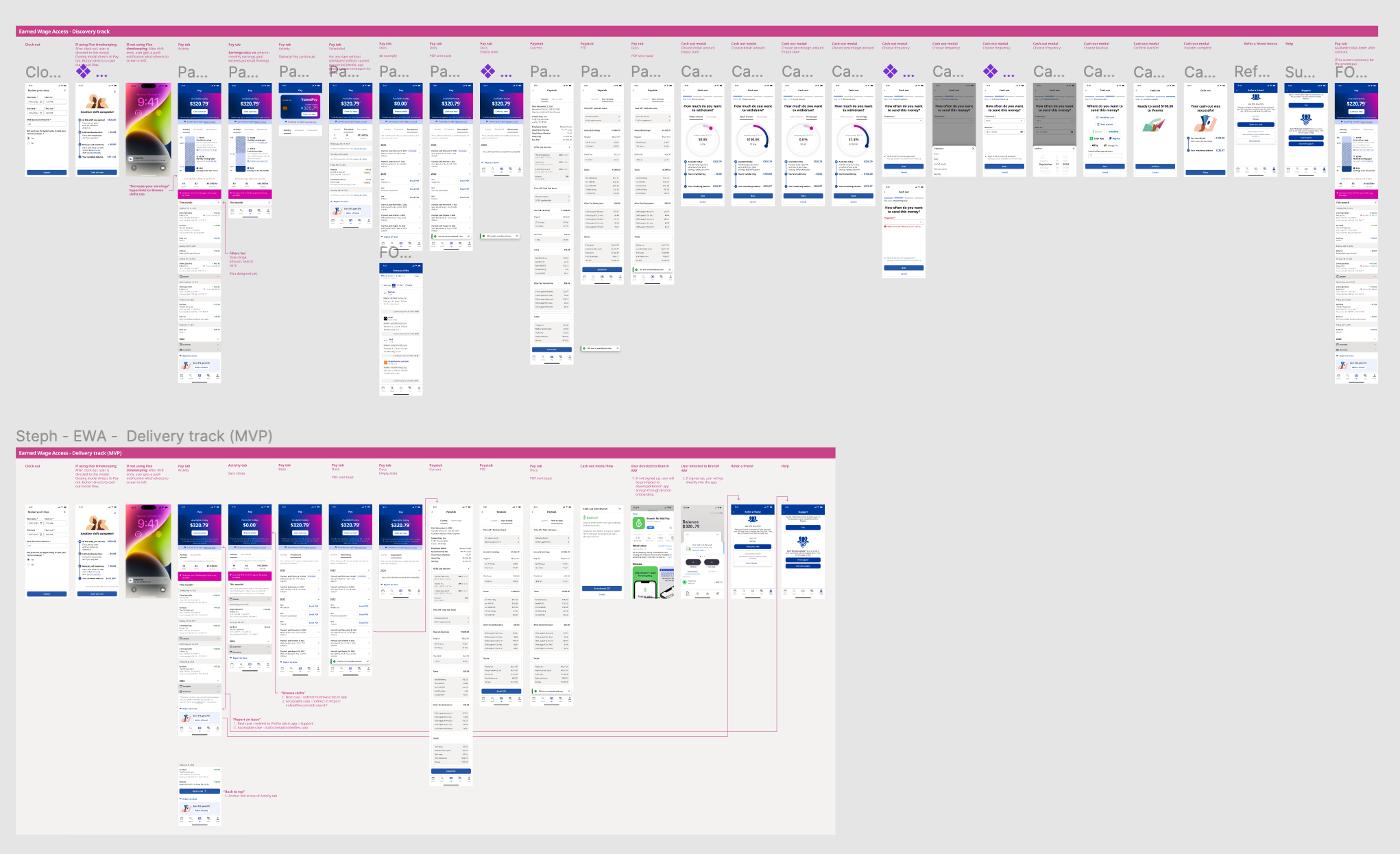
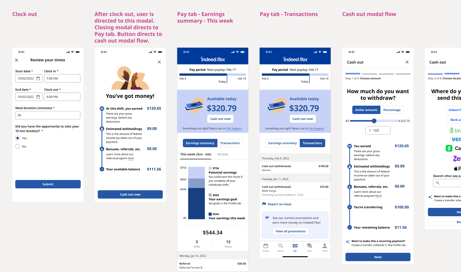
Figma file showing difference in scope between Discovery design (top) and Delivery design (bottom)
Step 1
Dream Vision & Requirements Workshop
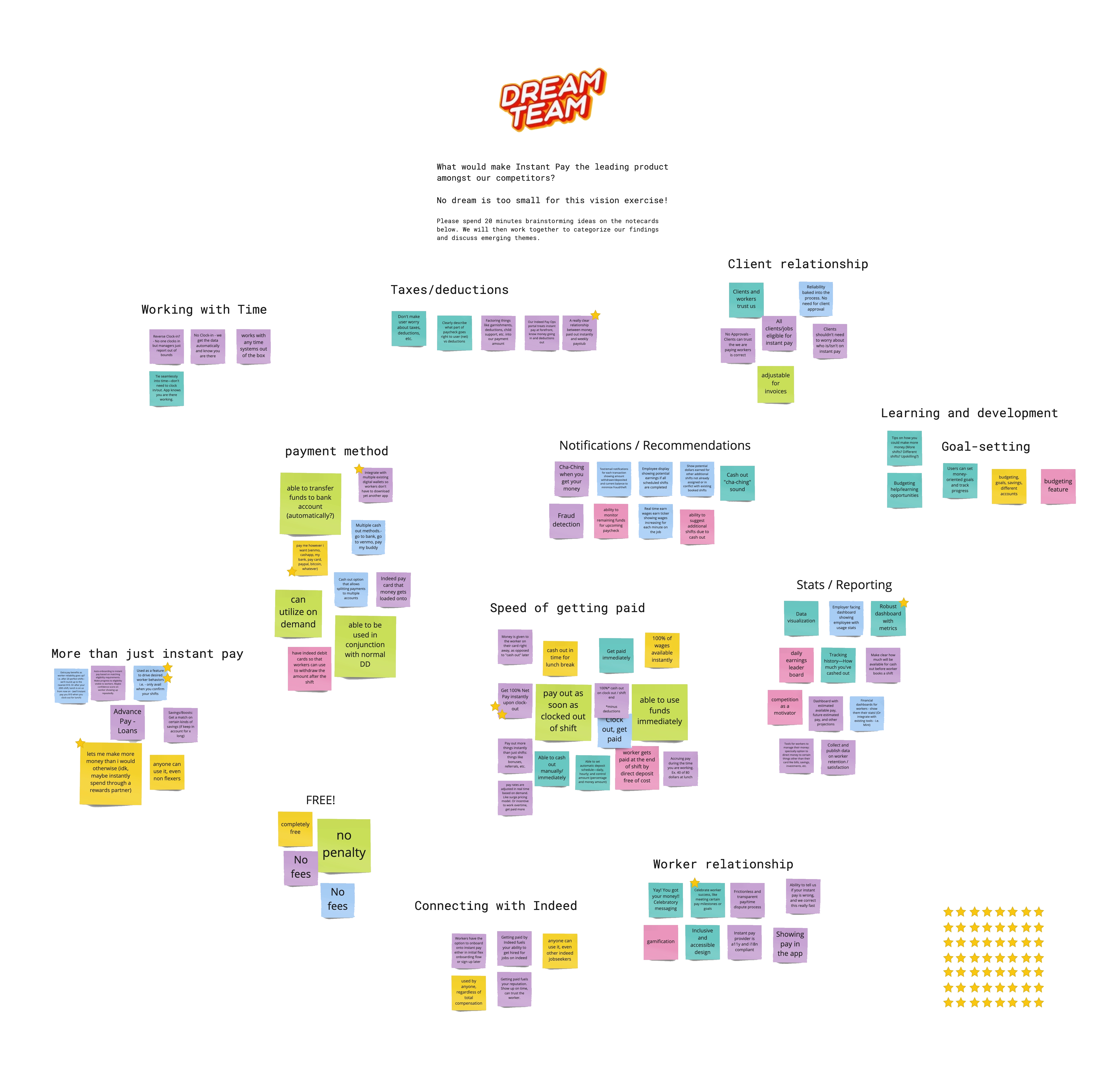
A new joiner to the Pay team, I organized a workshop to leverage the historical company and industry knowledge of my longer-tenured colleagues. I made sure to include coworkers from all disciplines—Product Managers, Engineers, Data Scientists, leadership stakeholders, UX Researchers, and Payroll Specialists—as good ideas can come from anyone.
As part of my in-person and remote-friendly “Dream State” workshop, I asked participants “What would make Instant Pay the leading product amongst our competitors?” My coworkers were given 20 minutes to write ideas on sticky notes, with no vision being too small for this exercise. We then workshopped as a group to categorize all ideas according to shared themes. We took turns reading the notes in each grouping, ensuring every idea was heard and all voices participated. Finally, each participant was given a set of stars to vote on the ideas they thought we should tackle first.
Research details have been intentionally blurred
Step 2
Competitor & Comparative Audits
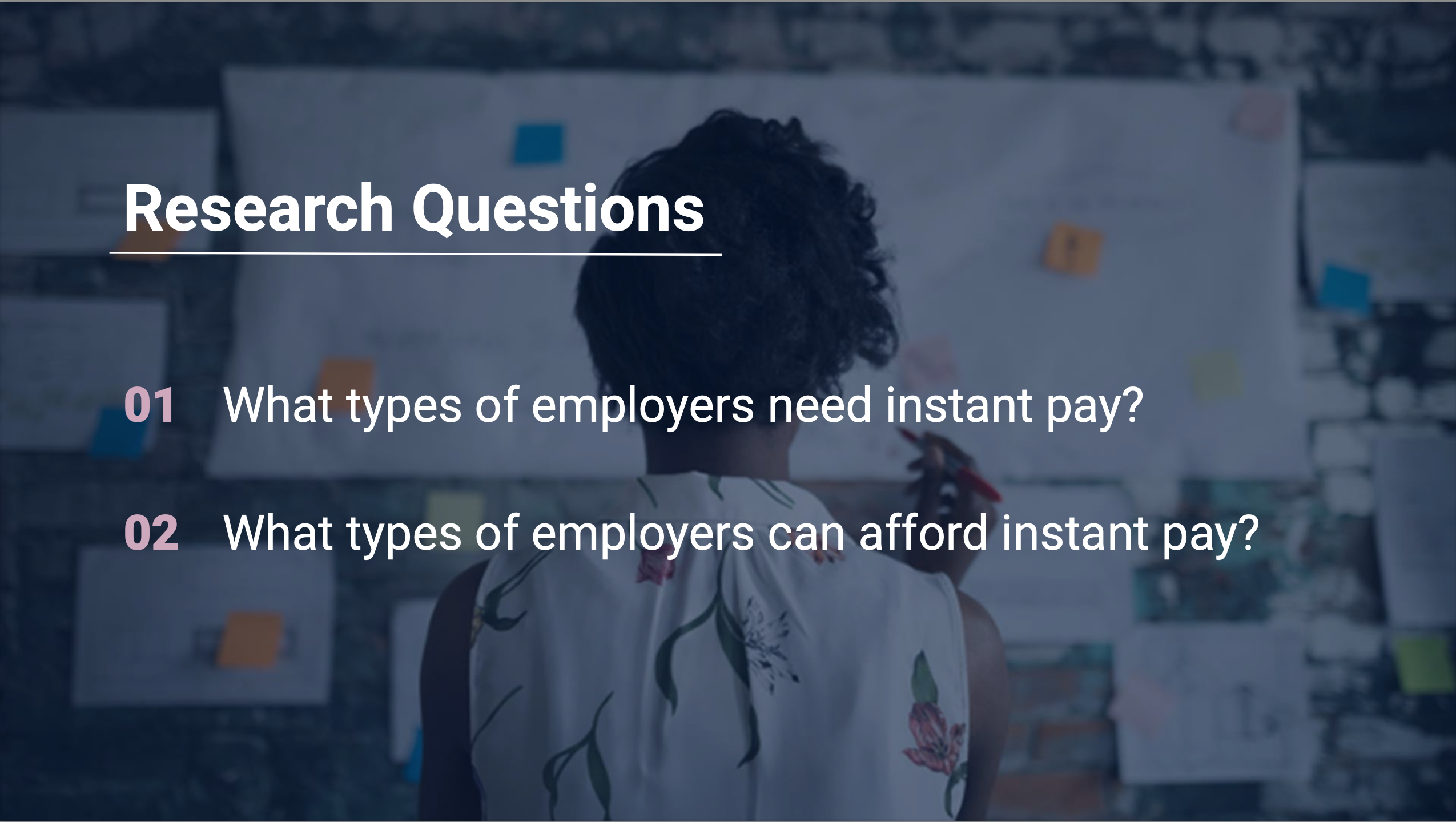
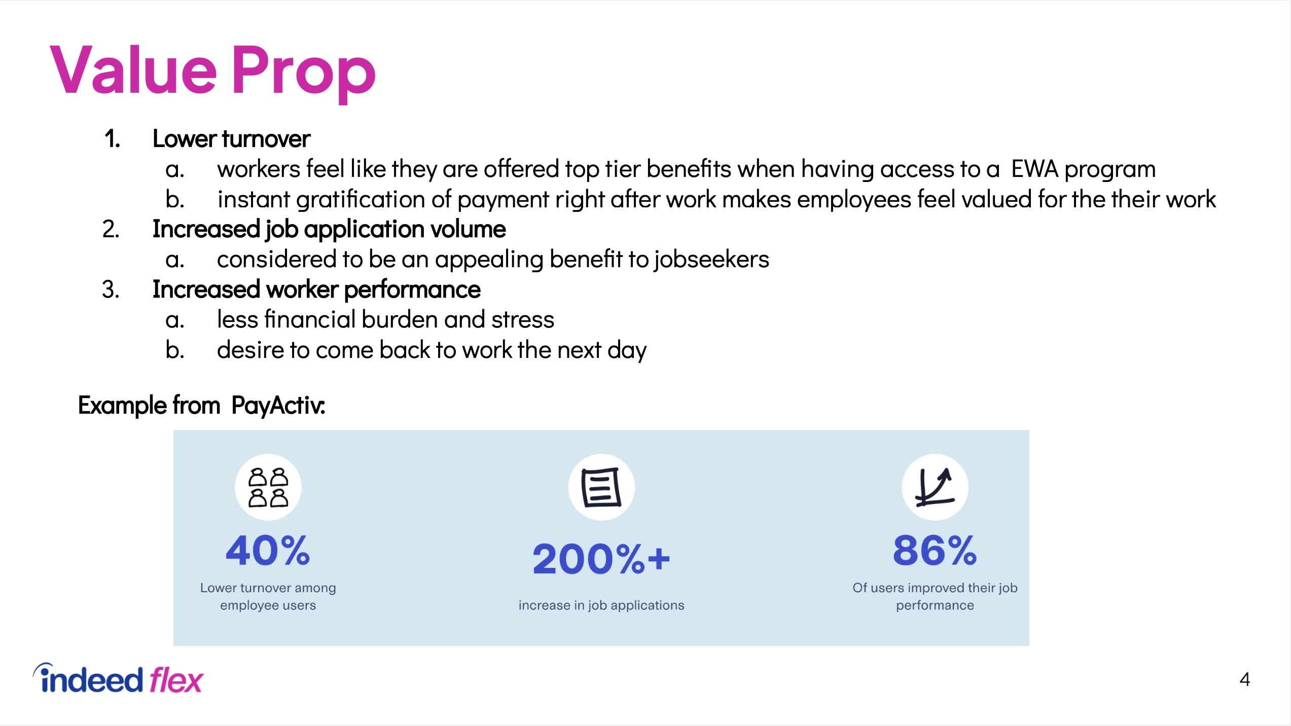
I partnered with our UX Researchers in the US and UK to understand the existing Instant Pay landscape and learn from the successes and pitfalls of our competitors. It was important to understand the market holistically—from the perspective of both employers and employees/workers.
Step 3
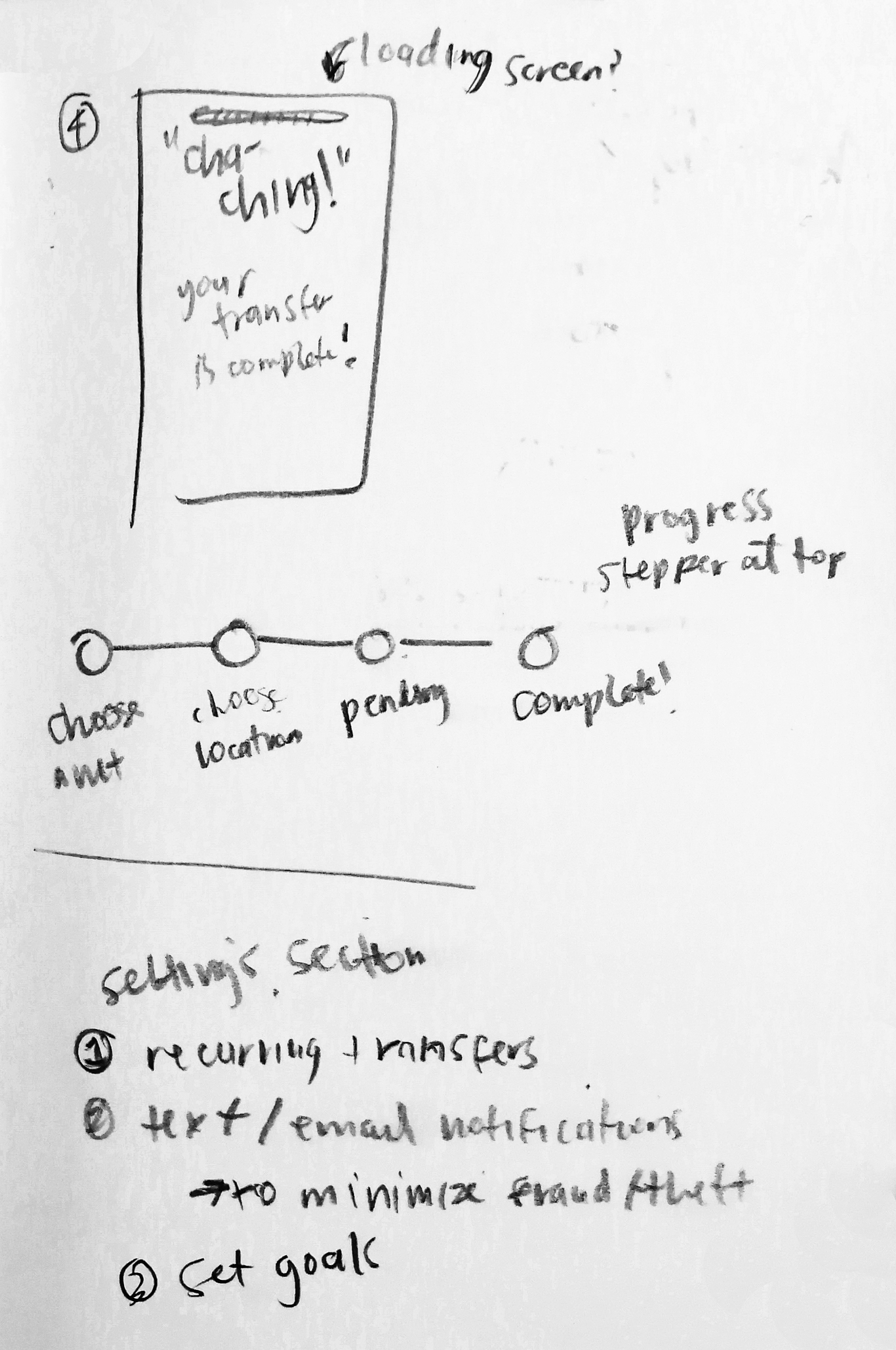
Sketches
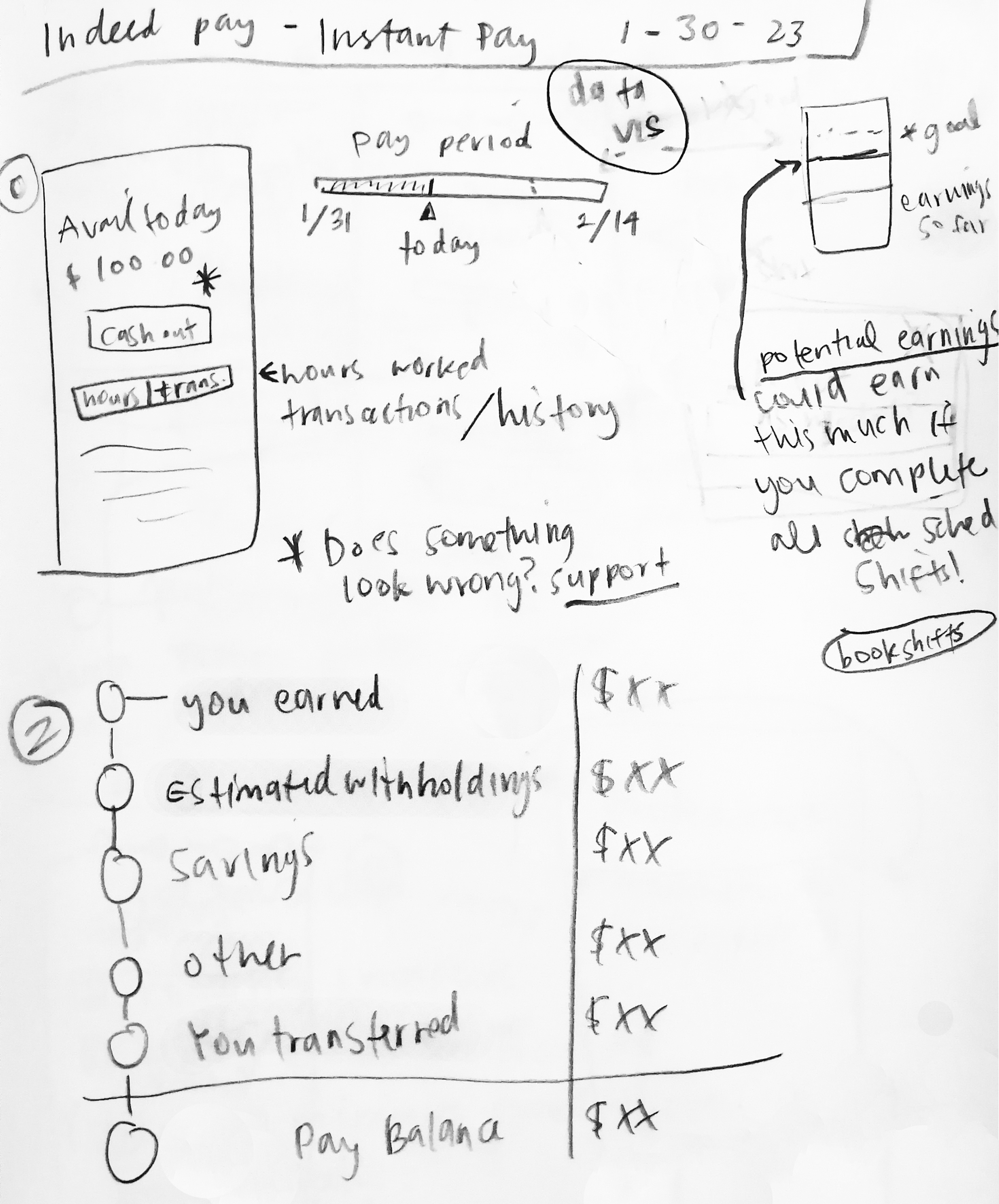
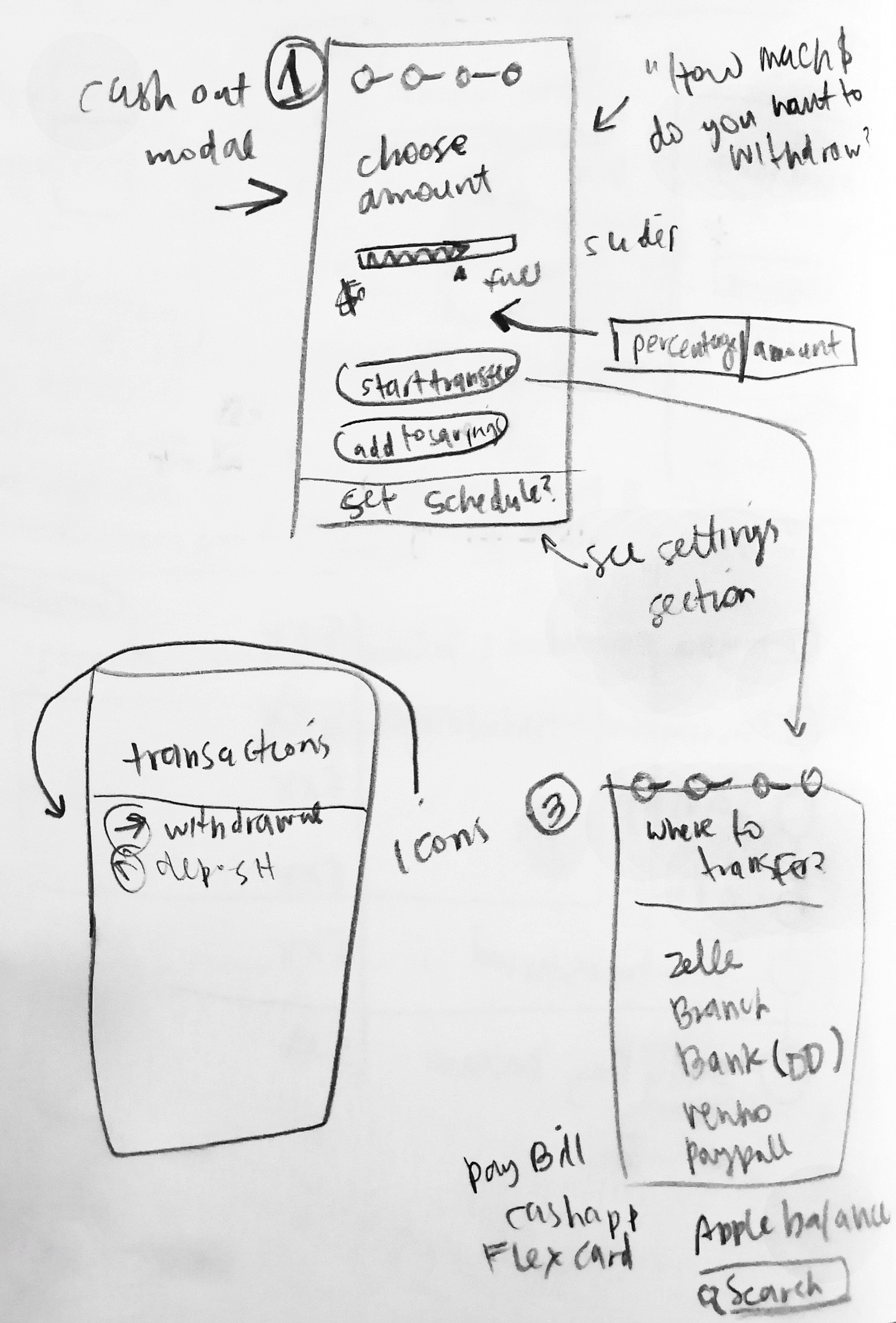
Drawing upon the insights uncovered in my dream vision workshop and our competitor and comparative audits, I began to outline potential solutions for our user personas.
Sketching is an important part of my initial design brainstorming process. Putting pencil to paper enables me to iterate in a faster and less-confined manner than digitally in Figma.
Step 4
Wireframes
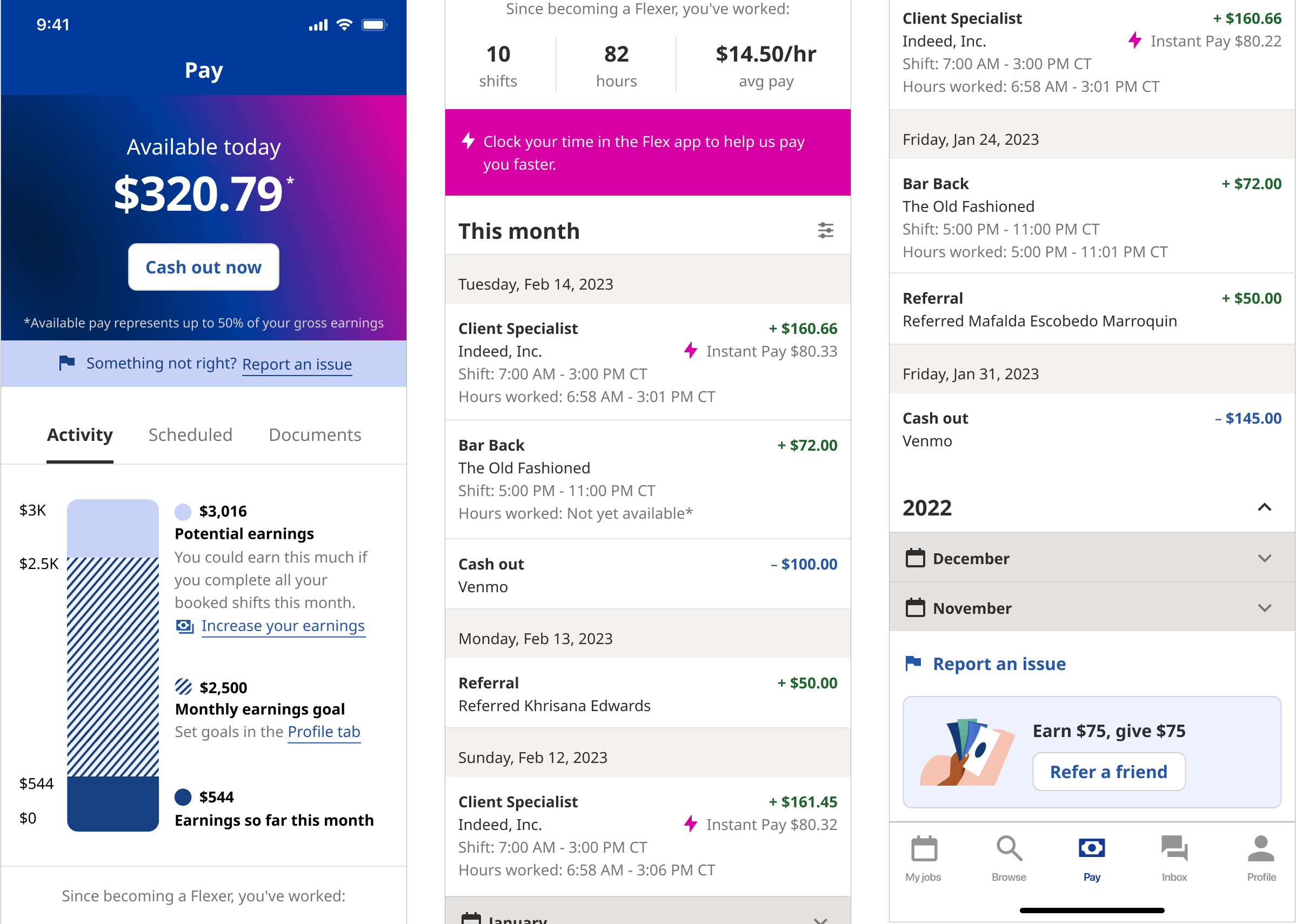
Leveraging Indeed’s robust Design System components, I was able to quickly bring my sketches to life. My first design was a bit clunky. After a design review with various stakeholders, we determined pay period information was not relevant to users at this stage.
I was determined to make the “Available today” banner more attention-grabbing to encourage users to take advantage of the new Instant Pay feature and cash out their wages.
Step 5
Present & Gather Feedback
On a daily standup cadence, I presented my work to my Product, Engineering, and Data Science teams—not only to keep them updated on my progress, but to garner feedback. My close-knit, trusting relationship with the Developers was incredibly beneficial in getting unblocked quickly and designing for changing requirements.
Step 6
Scale Back
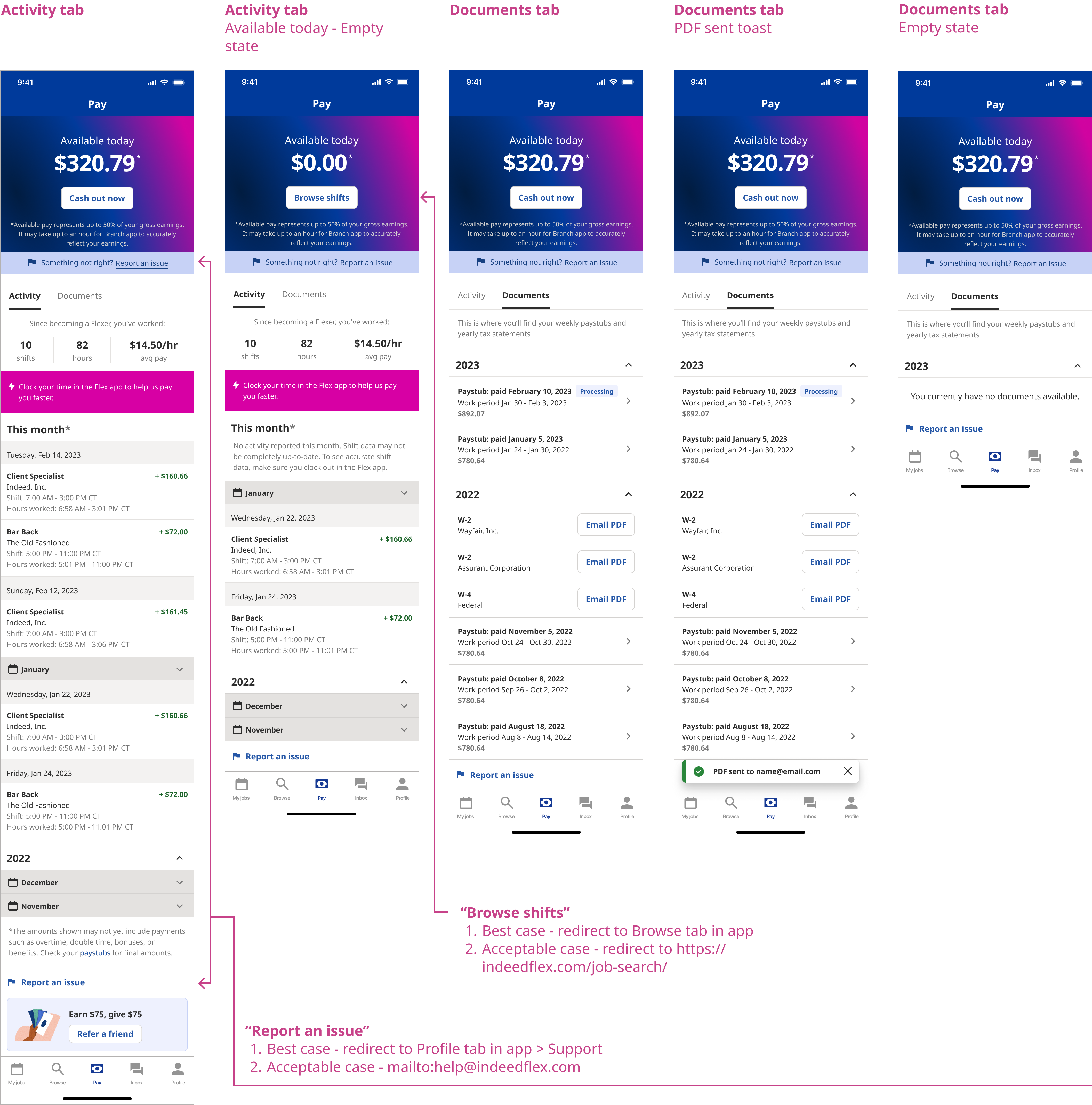
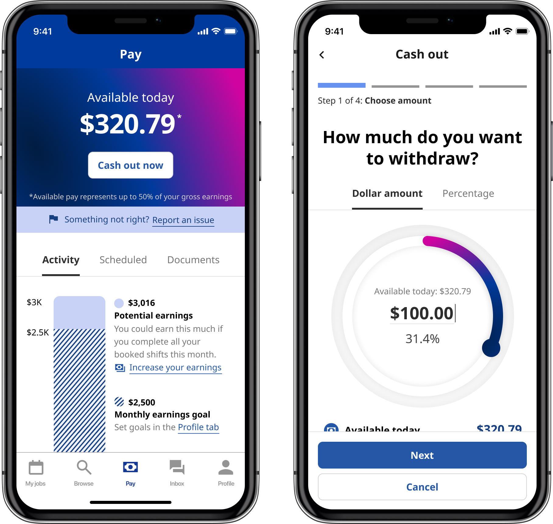
Engineering resources and time constraints meant we were currently only able to deliver the “Activity” and “Documents” tabs of my Instant Pay UX. Among other features, I had to cut out forward-looking “Scheduled” transactions and add some disclaimers about the Activity amounts shown.

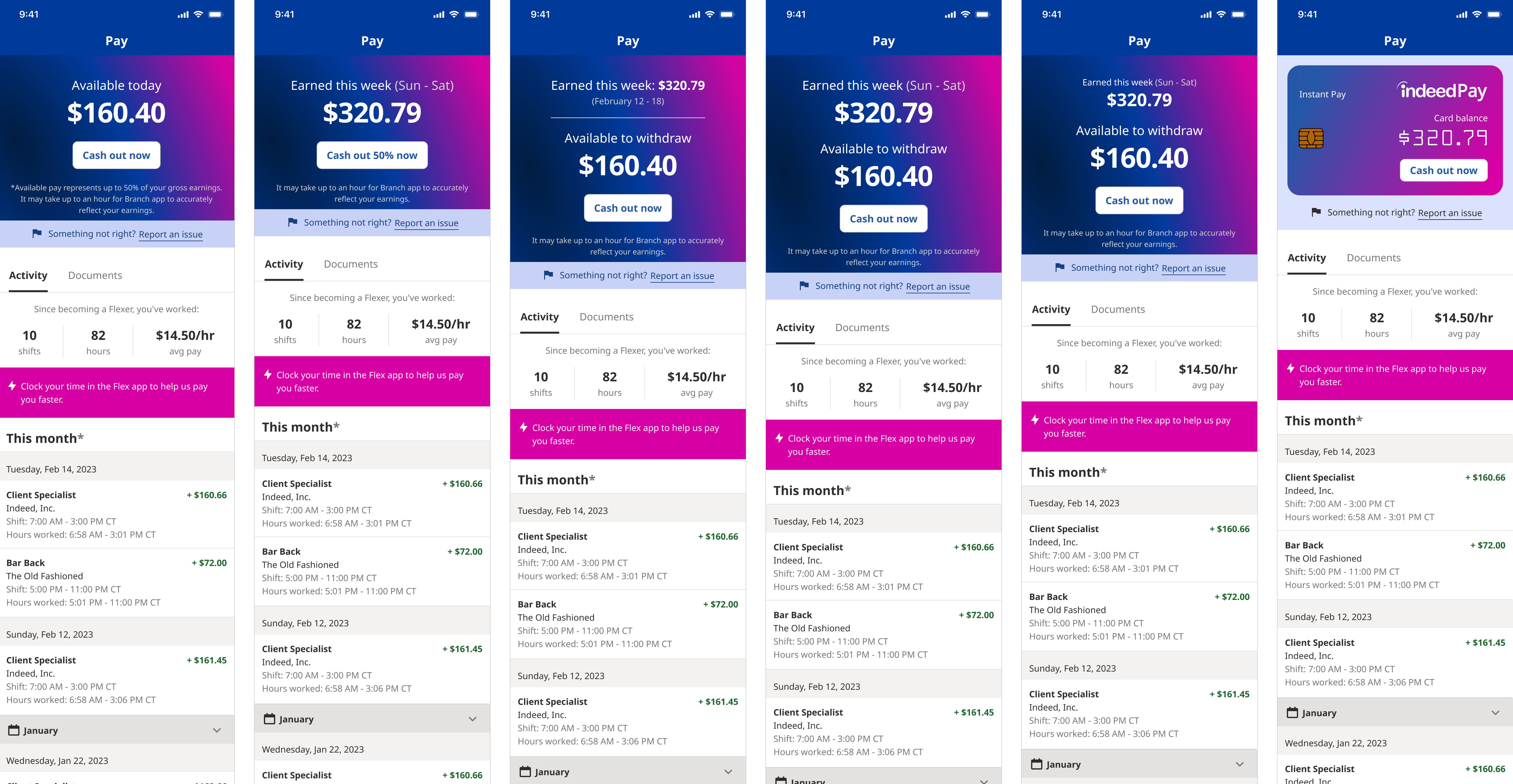
Step 7
Iterate!
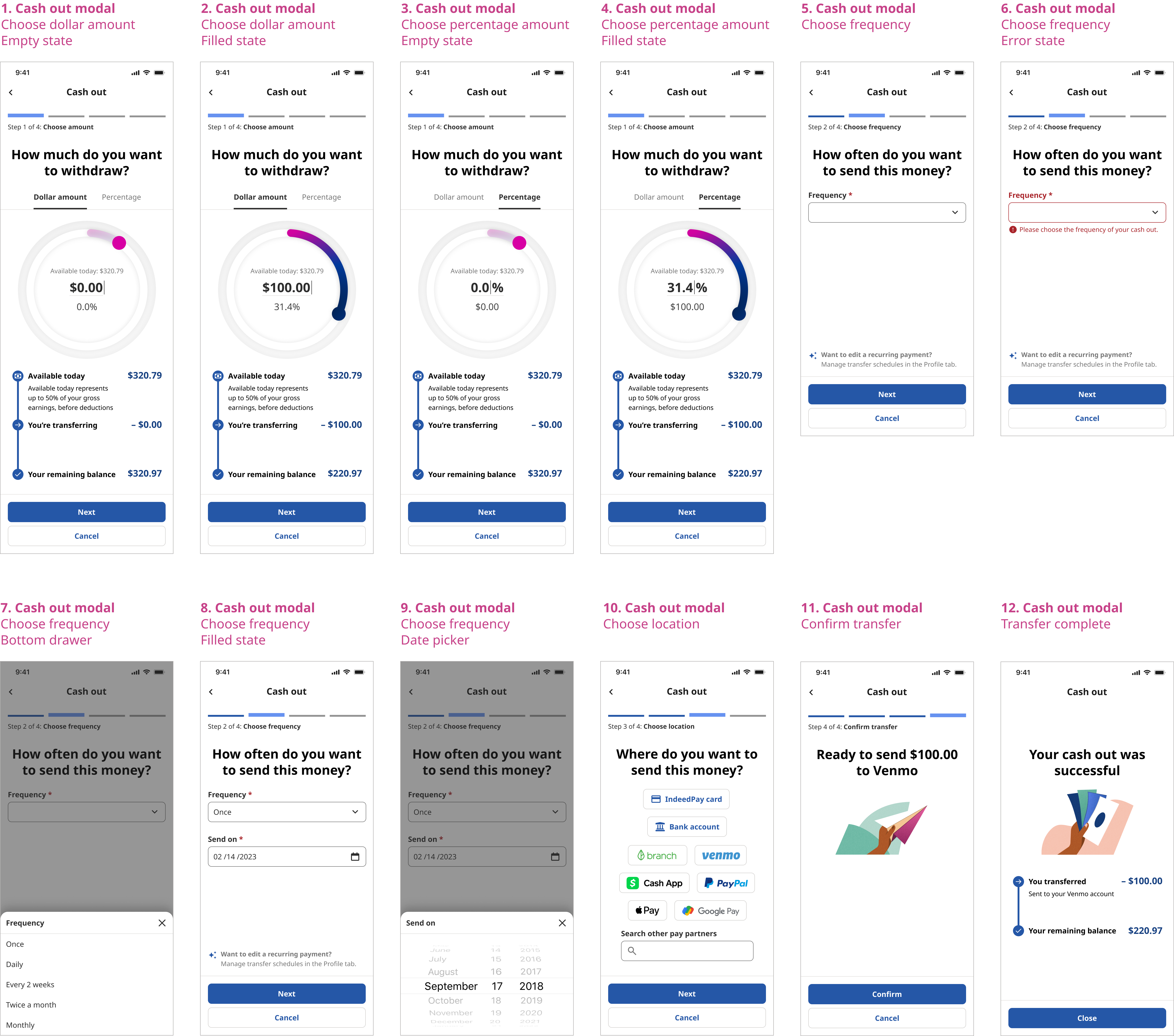
Our Engineers were promised access to a vendor API that ultimately never materialized. My design needed to pivot rapidly to acommodate new restraints. I explored both happy and unhappy user journeys, designing for every dependability.
Step 8
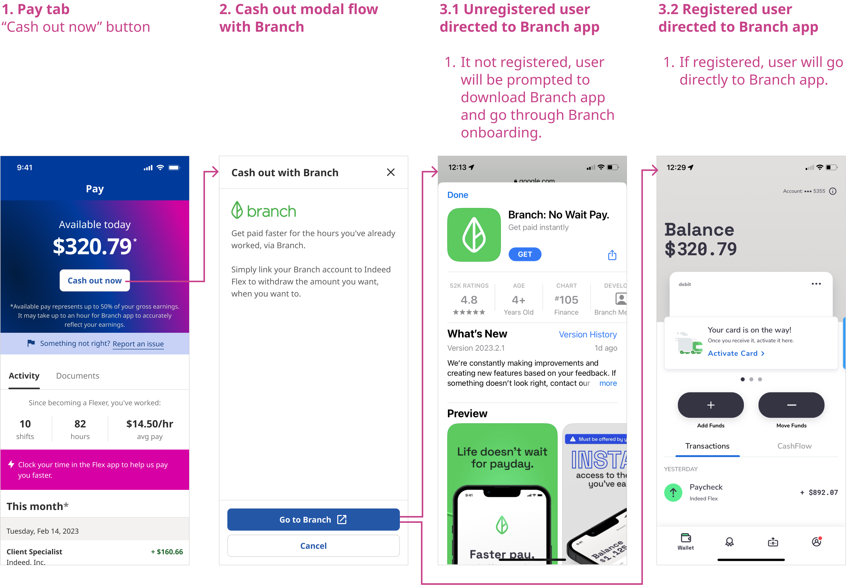
Iterate Again!
Indeed did not have the time or engineering resources to build the Discovery “dream vision” design cash out flow for phase 1 of this project. Instead, we integrated with a pay vendor called Branch. In the Branch app, users would manage their cash balance and withdrawals.
Step 9
Clickable Prototype
tinyurl.com/instant-pay
I linked all my Figma screens together in a clickable prototype. This helped high-level stakeholders quickly understand interaction flows and facilitated design conversations with Engineers.
Step 10
User Testing
In partnership with UX Research, we tested the usability of my prototype with various participants on UserTesting.com. We focused on the following experiences:
- Cash out task flow
- Earnings review screen
- Additional payout methods
- Discovering other pay partners
- Bar chart comprehension
- Browsing additional shifts for more earnings
- Instant pay icon/copy comprehension
- Expectations behind different tabs (Activity/Scheduled/Documents)
- Discovery – paystub/tax statement
The designs tested exceptionally well. All participants were able to complete the cash out flow without difficulty and rated their experience to be a 5 out of 5 on a scale of: (1) being not user-friendly at all, to (5) being extremely user-friendly. Participants were genuinely excited about the prospect of Instant Pay and the potential it had to transform their finances.
Next steps
The Engineers took over after this; this project is currently in development. I kept abreast of their progress and led user acceptance testing to catch bugs. As a result of this project, our team experienced an impressive improvement in Developer/Designer trust, demonstrated by cheerful willingness to collaborate and iterate together.
Further steps include:
- Introduce Instant Pay to the UK Indeed Flex market, partnering with a vendor in that country
- Build phase 2, which more closely aligns with my Discovery “dream vision” design
- Design options for workers to set up recurring cash out payments and pay bills directly from their Indeed Flex account
- Create an IndeedPay digital debit card—linked to workers’ Indeed Flex accounts—that can be used anywhere smart phone wallets are accepted
