Dr. Sweet Teeth: Candy Packaging
Project Overview
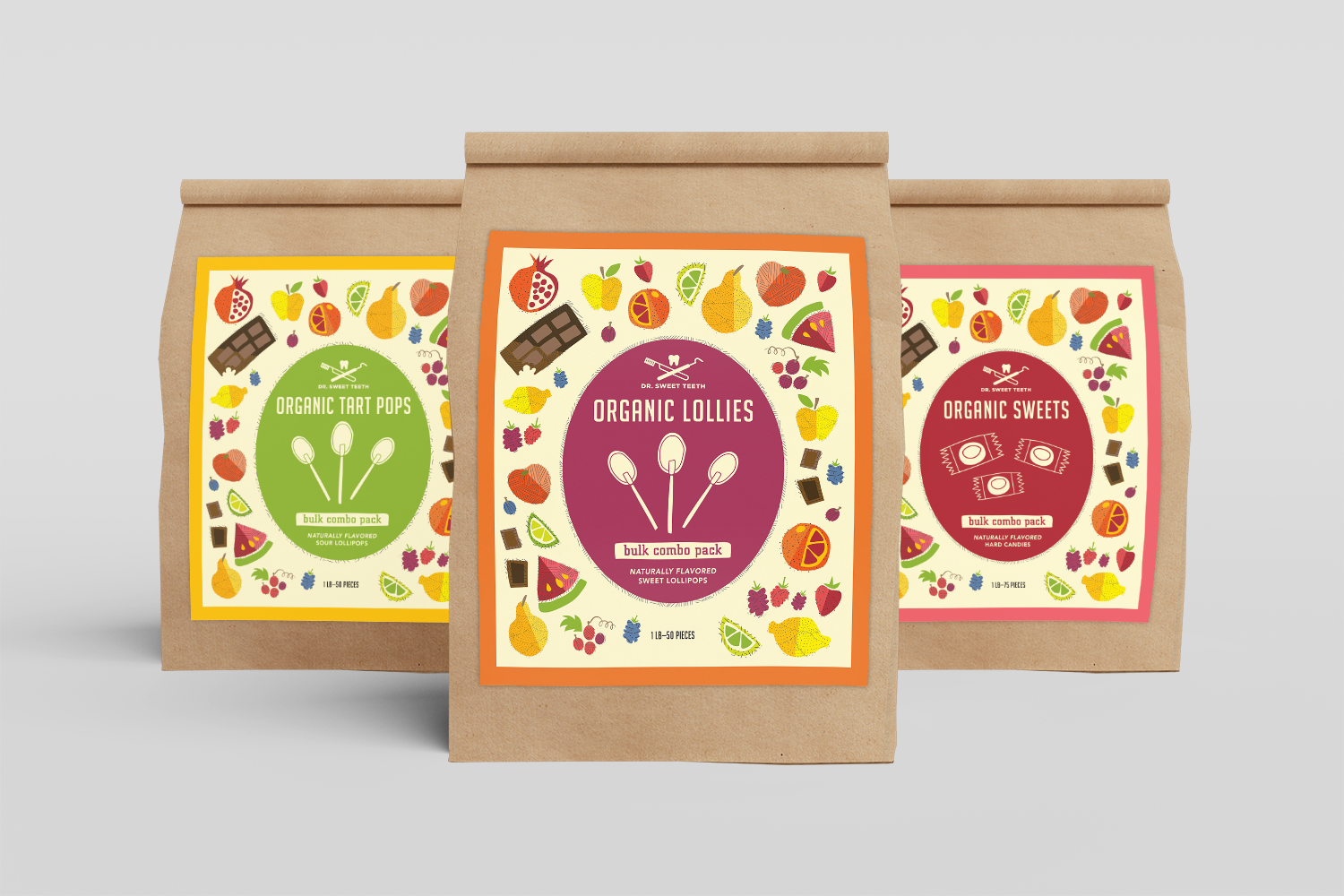
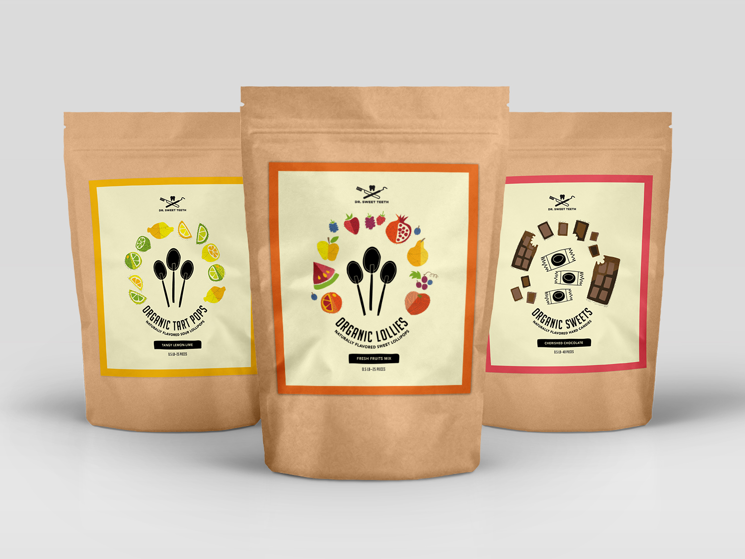
This project features bulk and smaller-sized packaging for a line of delicious candies created without sugar—the preferred treats offered at dentist offices. The packaging is designed to feel playful and natural, without looking medical or sterile.
ROLES
Graphic Designer, Illustrator
Deliverables
Logo, illustration, packaging
A Cost-Saving Solution
I was tasked with creating a packaging redesign that would capture the attention of a market audience that includes both children (the principal product consumers) and adults (the ultimate product purchasers). My research of the original design and cross-market products concluded that Dr. Sweet Teeth was out-of-touch with its desired customers and could benefit from lower production costs. The packaging needed to be cost-effective to successfully and economically sustain growing bulk orders. In order to optimize the budget, I created this packaging design as a line of sticker labels to be placed over brown bags.


Fruity and Fun
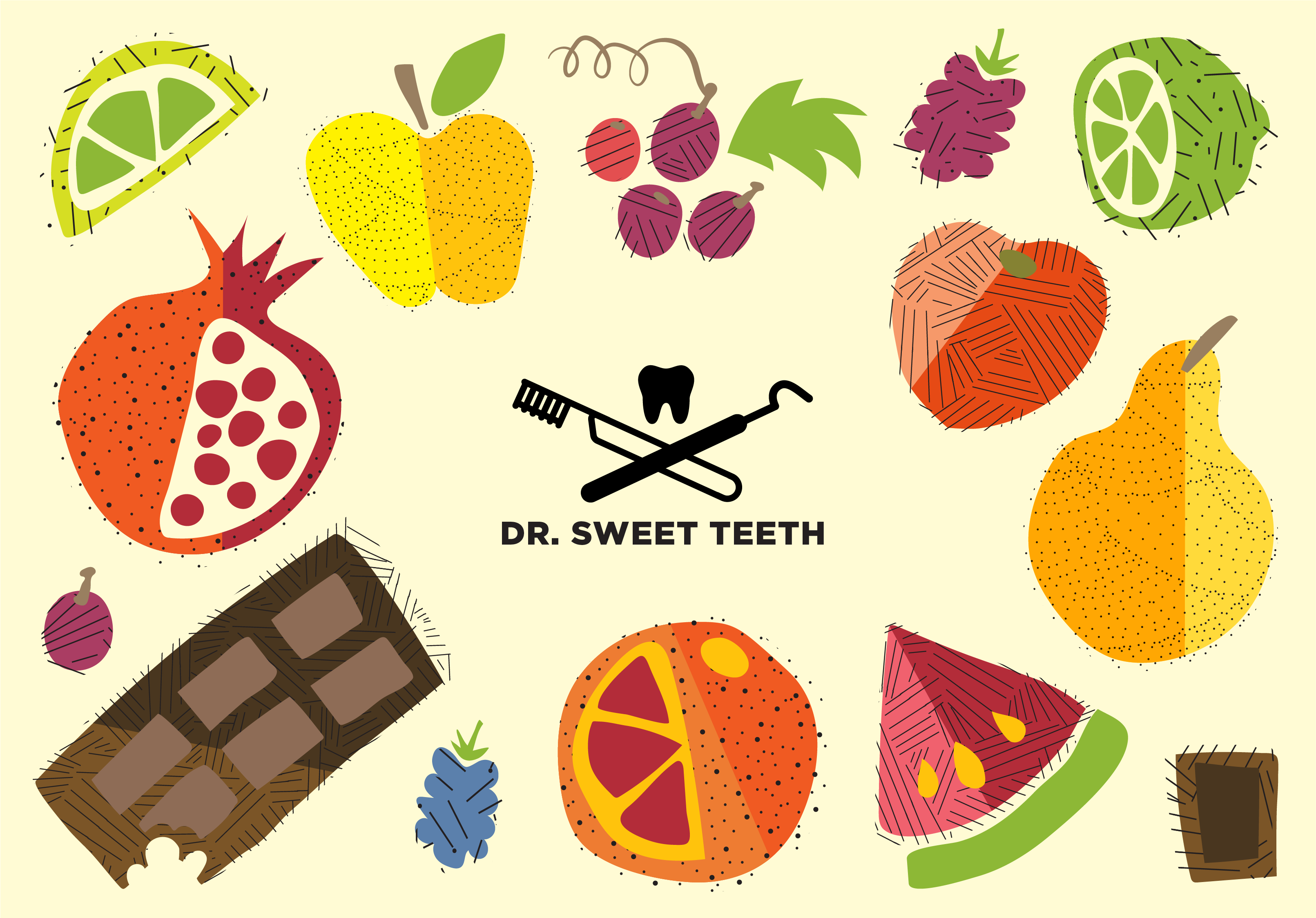
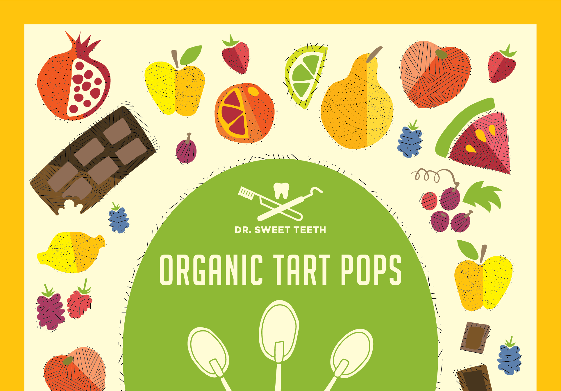
A lot of “sugar-free” candies appear overly geriatric, medical, or sterile. To combat this, I drew fun illustrations in bright colors and included relevant industry words in the product description to attract health-conscious consumers.
